Research
Design history
Every version of the design, rendered from its commit at iPhone size (390 × 844 pt), with what
changed and why, in the owner's words where they gave them. The screenshots come from
a script that can re-render any commit, so this page can be rebuilt or extended
at any time. New versions are added here as they land.
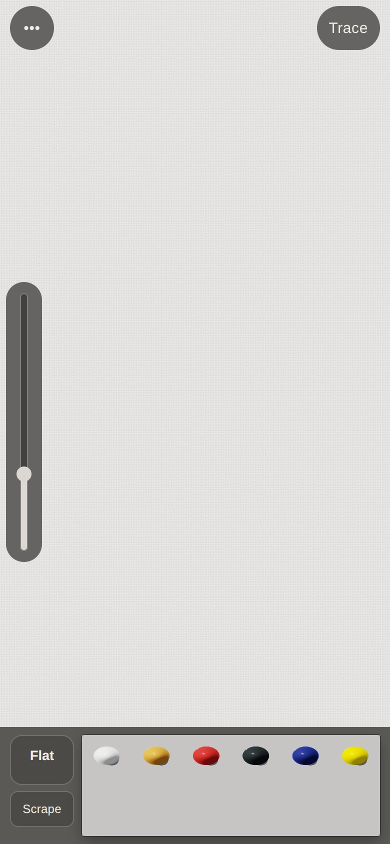
1 · The first UI (ffc2d3c)
A grey toolbar: tool and scrape buttons, six paint blobs in a dish, a size slider on the left.
It worked, but it was heavy and generic.
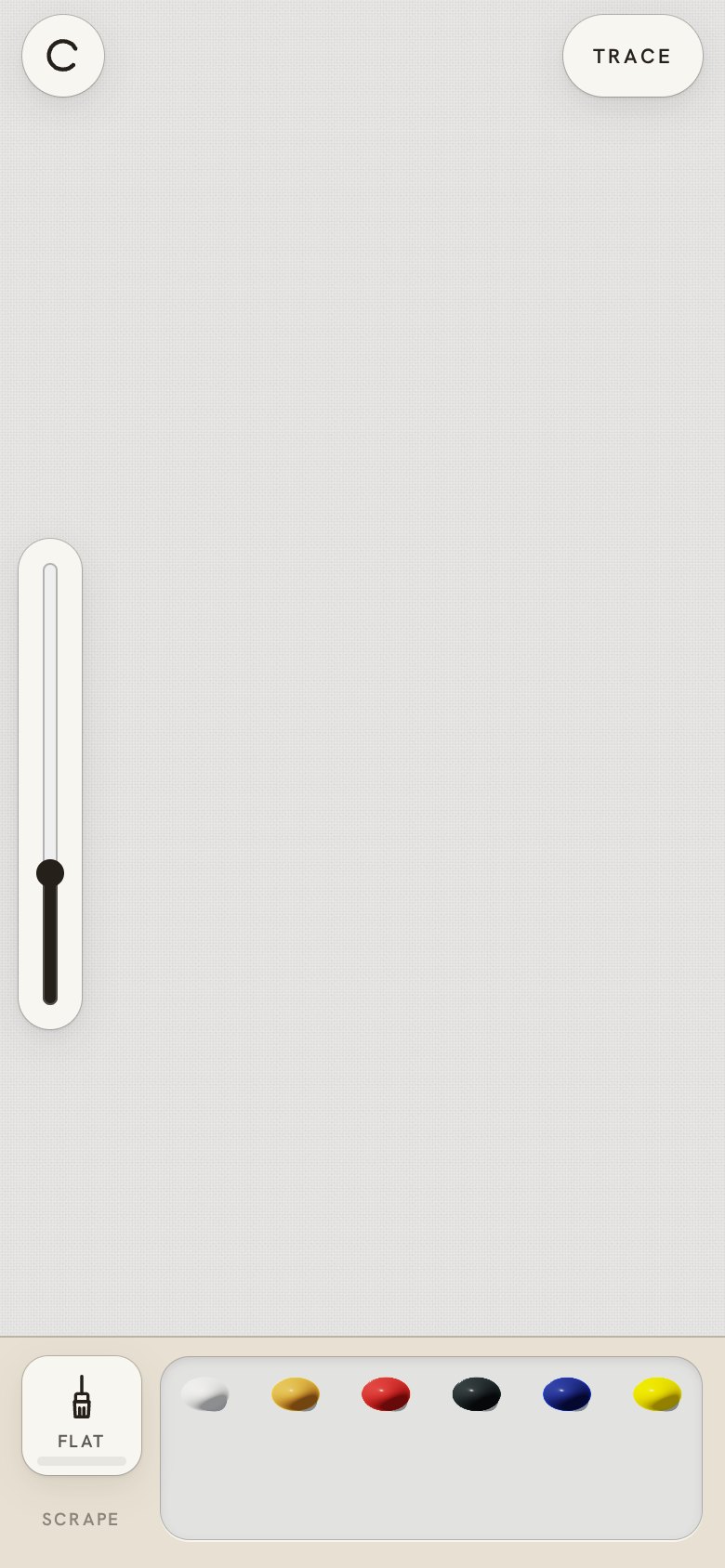
2 · Kinari, a Japanese studio (20611c6)
"The app is stuck, need better UI, love to get Japanese inspiration." Paper colours (kinari and
washi), thin ink line icons, a seal-red accent, one quiet typeface. The layout stayed the same.
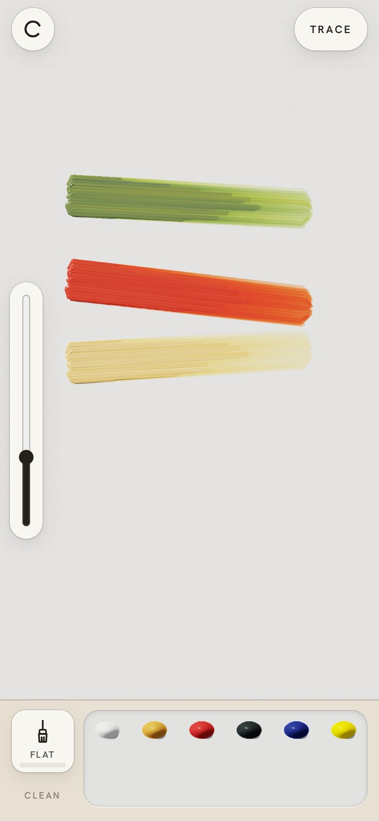
3 · The porcelain palette (e9dd6d0)
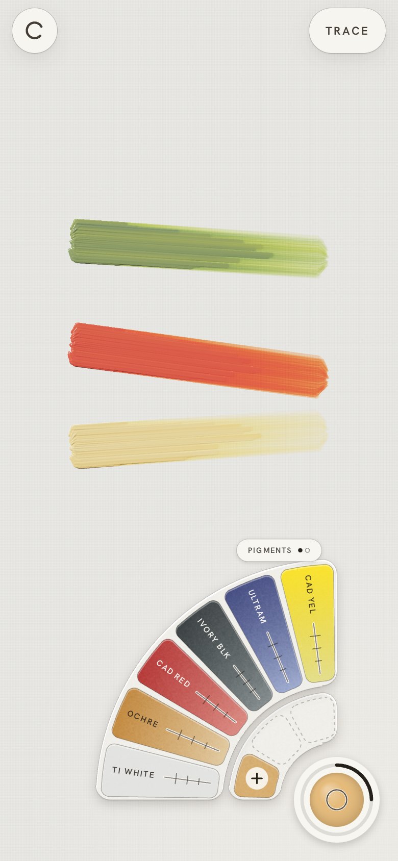
"When I touch colour in the palette I can pick it up to mix." Paint sits in a porcelain dish you
tap to load the brush and drag to mix. The owner's verdict later: "not big enough, not useful";
and the size slider was "not easy to use".
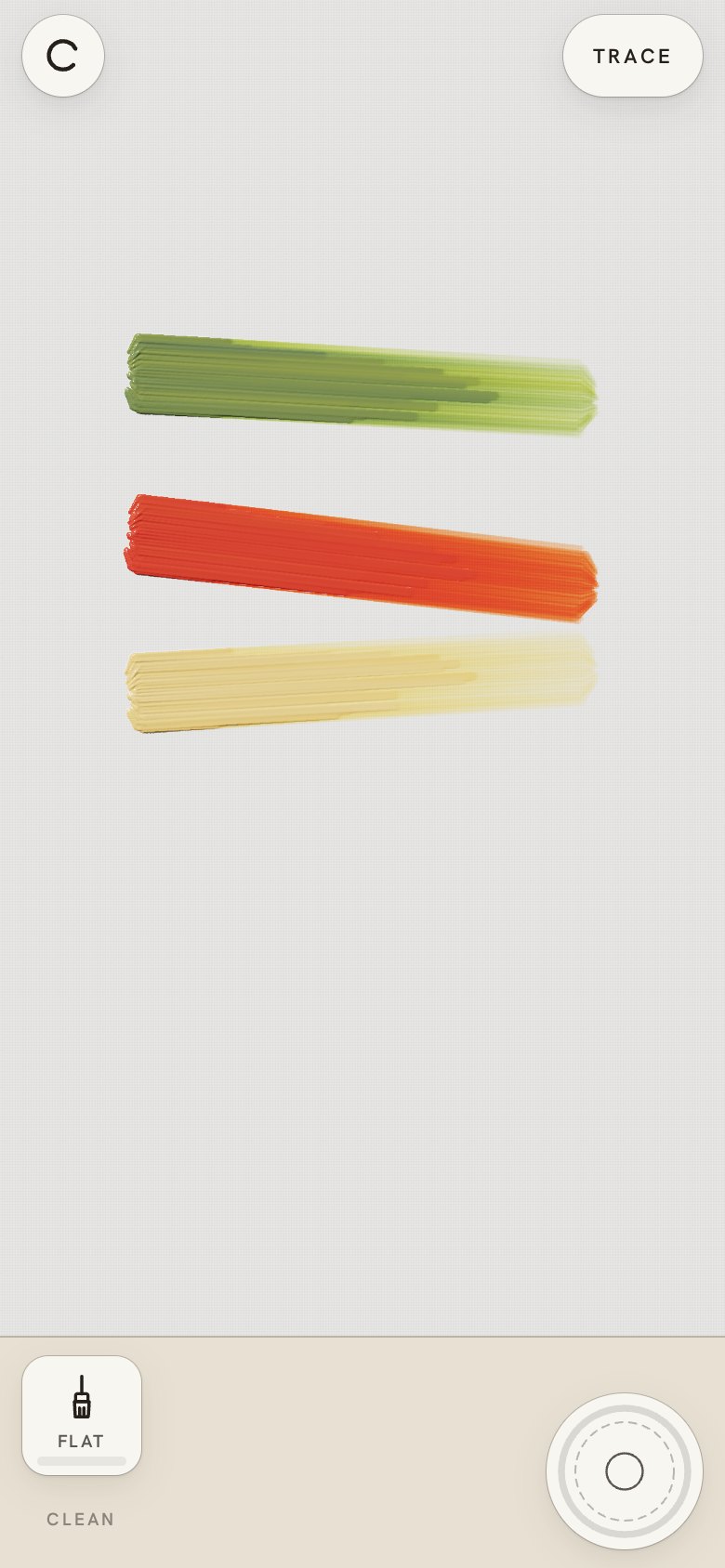
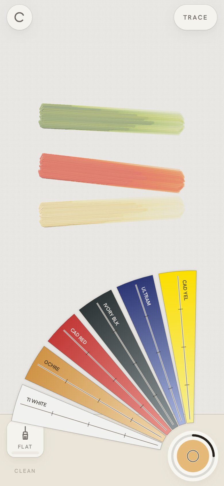
4 · The brush well and the colour fan (2b63480)
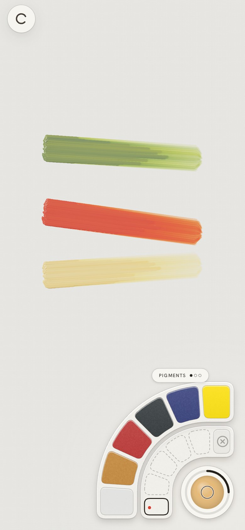
The owner's own design: "think of a radial menu: centre = current colour, tap to pick colour,
outline shows how much, long press opens a colour fan that literally fans out; each leaf has a
line; far = more of that colour, near = less." Size moved into the same control (drag the well).
| The screen |
Hold the well: the fan |
 |
 |
5 · Quarter radials in both corners (a2adc83)
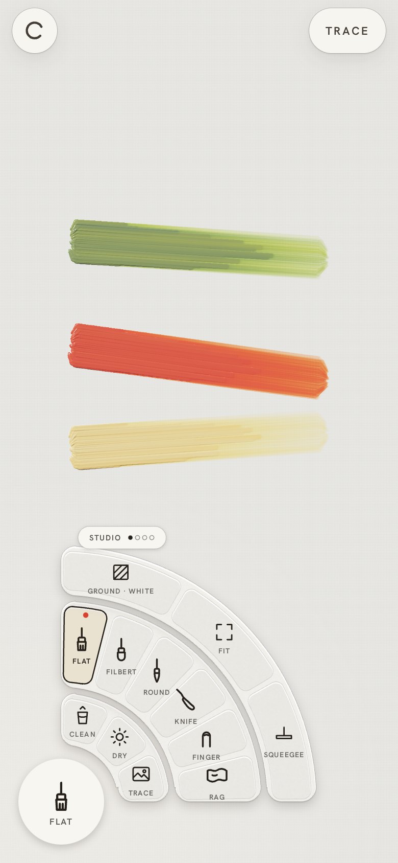
"Same distance from bottom and right side; another one on the left for the brushes." Then a
Figma reference from the owner's earlier work, a full collapsible radial with levels: "we can't
use it as is, we have a small surface … a quarter of a radial menu with few levels … look at the
visual quality … tap once on the right to get colours, on raised rings with drop shadow; tap on
the left for brush type and other actions, with an additional circle for other tools."
6 · Swappable outer rings (3588376)
From the Figma's "swappable menus": drag along the outer ring and the next set rotates in, or tap
its tab. "Rotating the outer ring is great, let's keep it."
7 · Rings from the well's edge, even padding (9166b1f)
The owner marked two lines touching the well: "have the expansion rings start from the outer
radius of the circle", and "the selections same padding from the nearest edge". Rings run past
their quarter to those lines; items sit an even 6 pt from every edge.
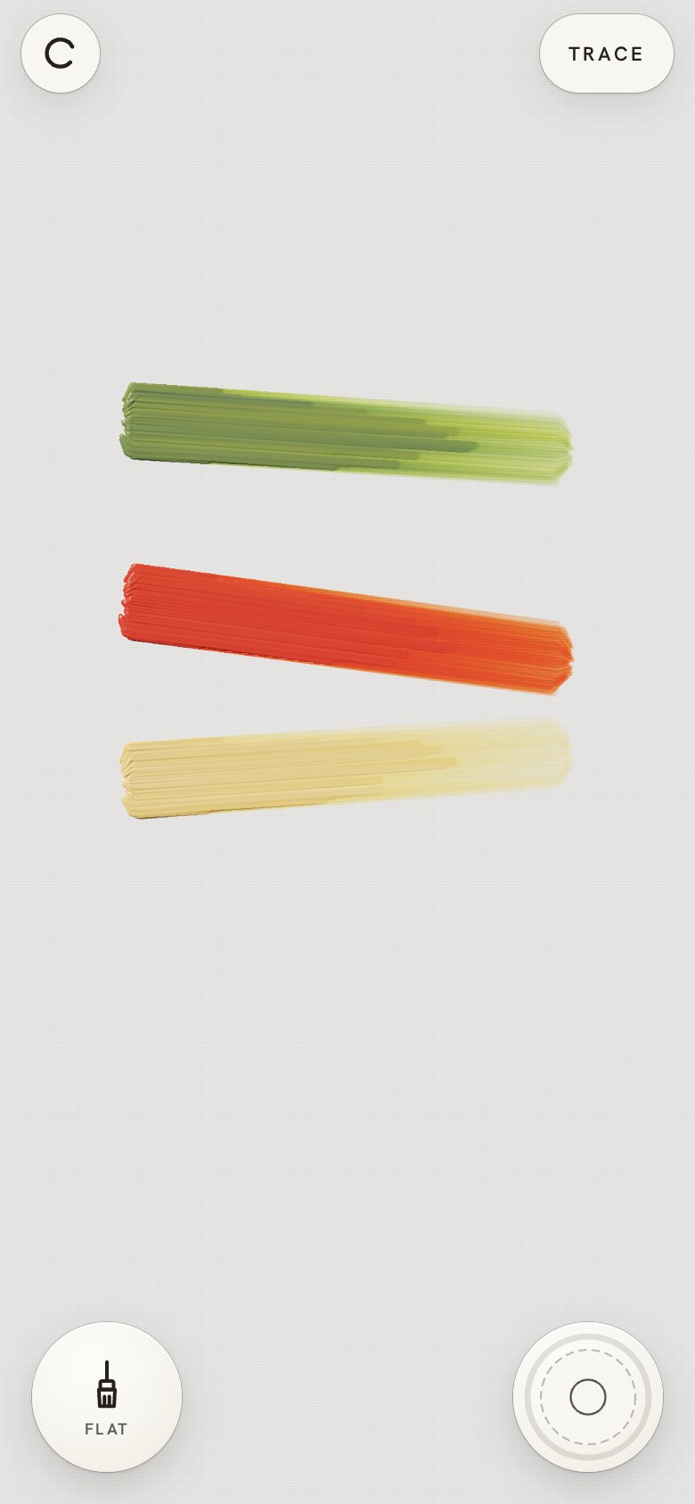
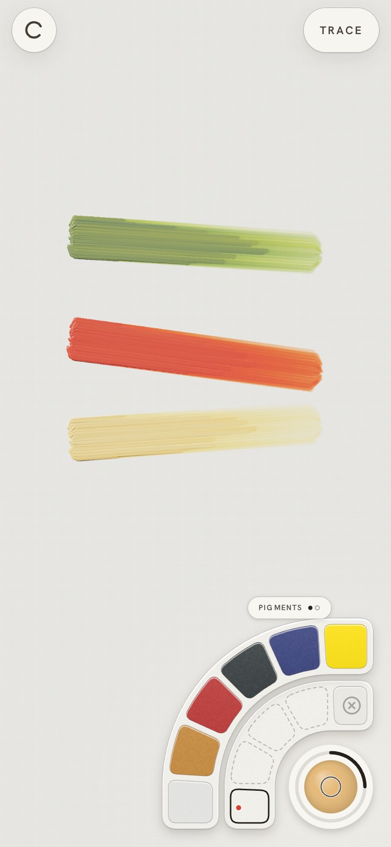
8 · Stored colours, straight rings, hold to open (c37381e)
A run of owner feedback, in order:
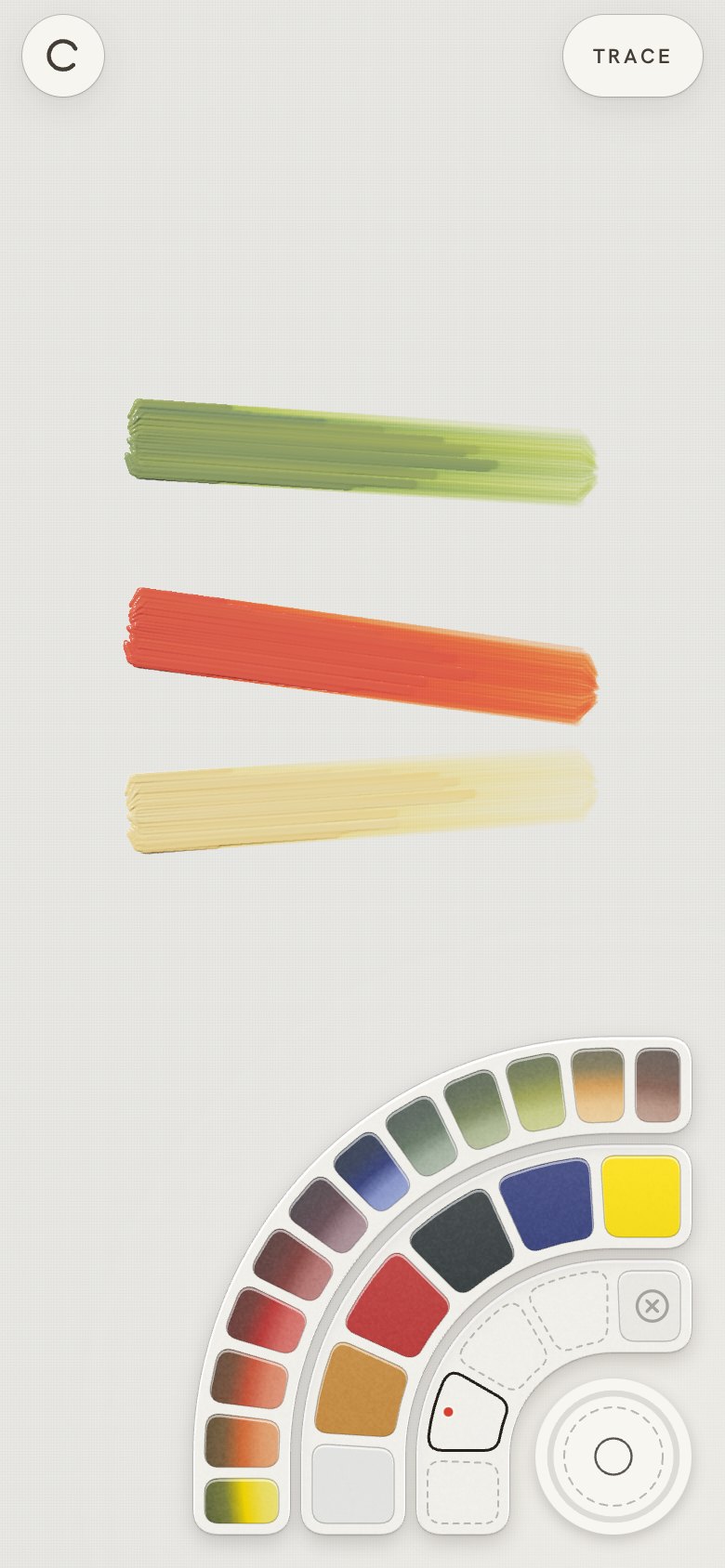
- "Mid colour ring: I expected stored colours for quick access; tap to select, use the outer ring
to add colour." Four stored colours, each keeping its own recipe; Clear empties one ("need
action to clear").
- "Tap on an empty colour slot will bring another outer ring with a wider colour range": twelve
hues mixed from the six pigments, light to deep across the ring.
- "Remove the slide … make that ring tighter": each tap adds one part, so the pigment ring is thin.
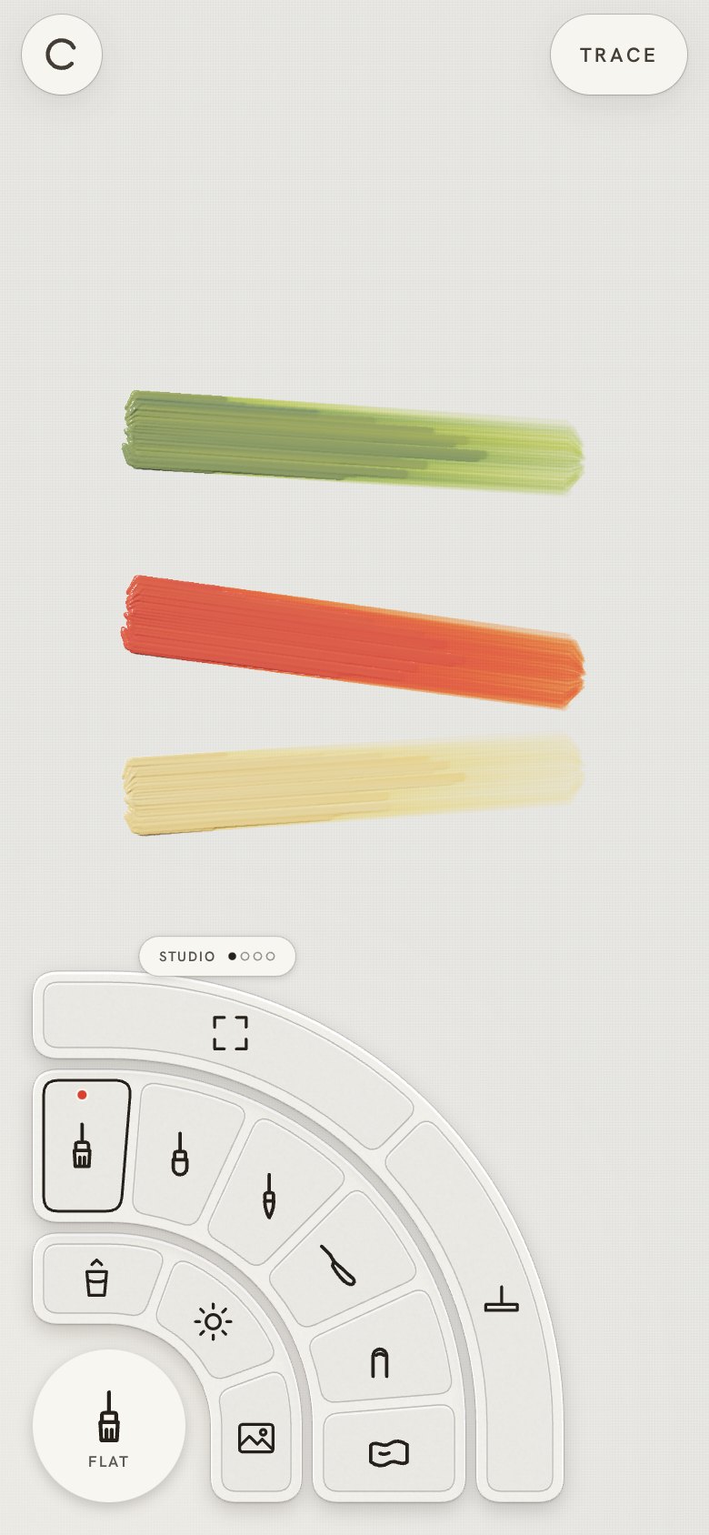
- "Left ring, remove labels; labels as temporary tooltips."
- "Gesso, maybe remove, why is it needed?" The ground moved off the ring, into the menu.
- "Same outline stroke on both sides; make the outer rings continue in straight lines": each ring
is now an L concentric with the screen's corner.
- "First tap on the circles needs to be pick up colour, so a better interaction to open menus":
tap = pick up colour (or the previous tool, on the left); hold opens the rings, and you can slide
onto an item and lift.
| The screen |
Colours |
An empty colour: the range |
Tools |
 |
 |
 |
 |
9 · Marking to open, a clearer outer ring, gaze-down light
- "Love the new tooltips."
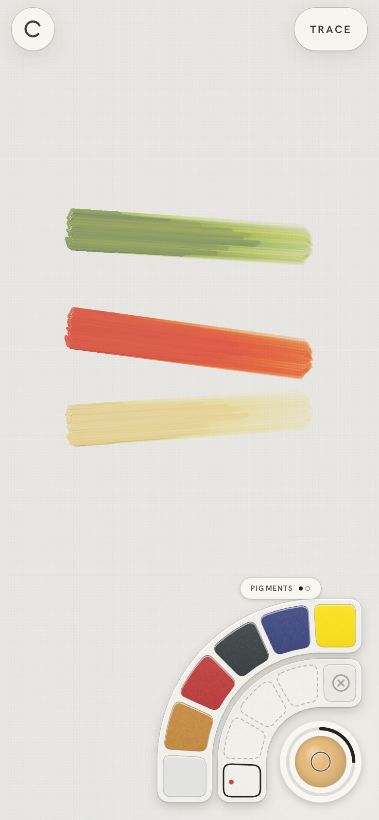
- "Need improvement on the 2nd ring interaction: what is it for?" The outer colour ring adds to
the selected colour, but nothing showed it. Now each tap throws a drop of that paint into the
selected colour (with a ripple), tooltips say "Add Ultramarine", and the selected colour shows
its recipe as a dot per part.
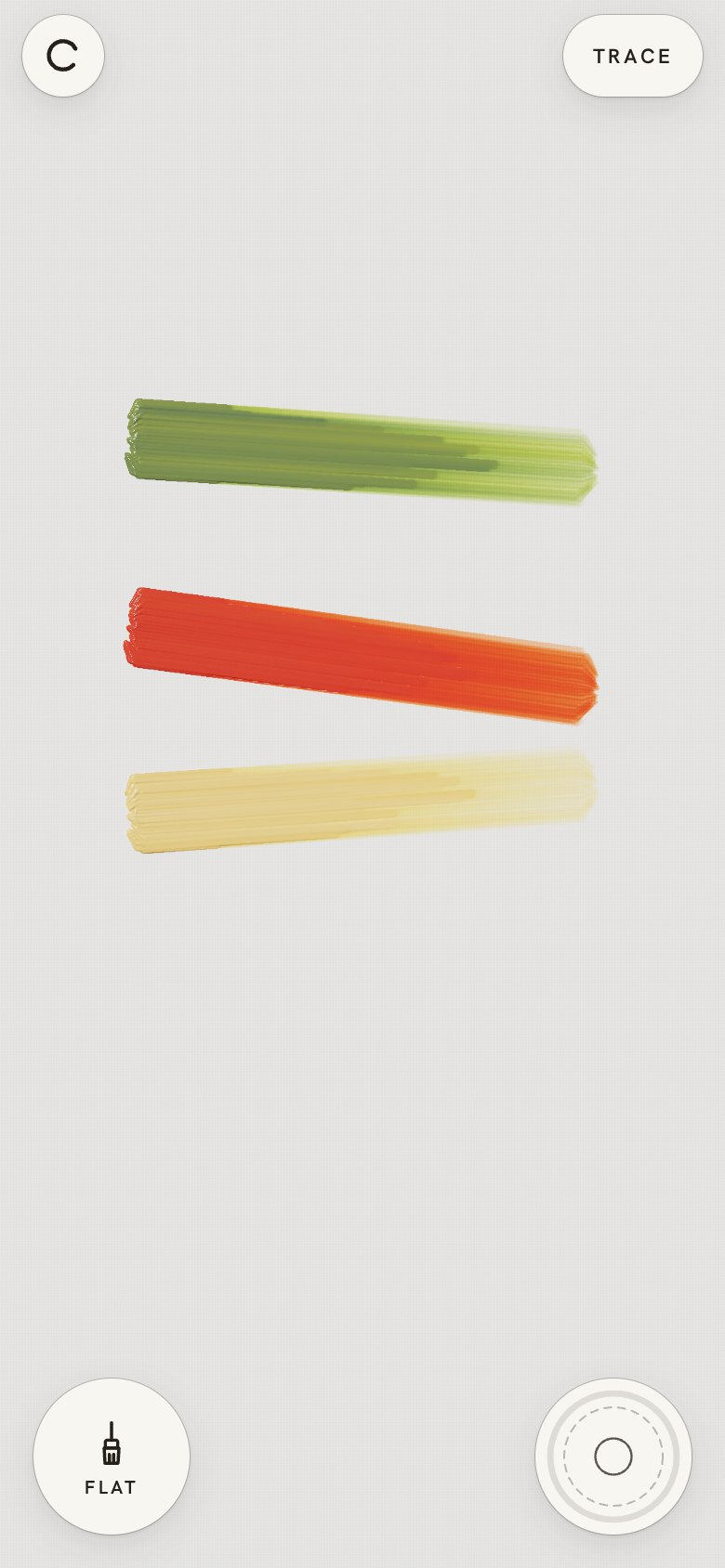
- "Can we use marking (press, move finger from circle) to open it?" Press a well and slide out:
the rings open at once and the same slide picks an item. Size moved into the open rings' centre
(drag it up or down), since an upward drag on the well now opens the rings.
- "Left circle should have the same treatment as the other buttons": both wells now match the
Menu and Trace buttons (paper, hairline, the same lift and type).
- "People do not hold phones at 90°, so think of gaze down … total grey due to light direction."
The light's reference is now the held pose (tipped back 40°, facing the painter), and the lamp
sits over the painter's left shoulder, lighting the canvas along the gaze. Brightness unchanged
("brightens everything ~7%: NO"; "I meant change the position of the light").
| The screen |
Colours |
An empty colour: the range |
Tools |
 |
 |
 |
 |
10 · One colour ring, a size arc, air
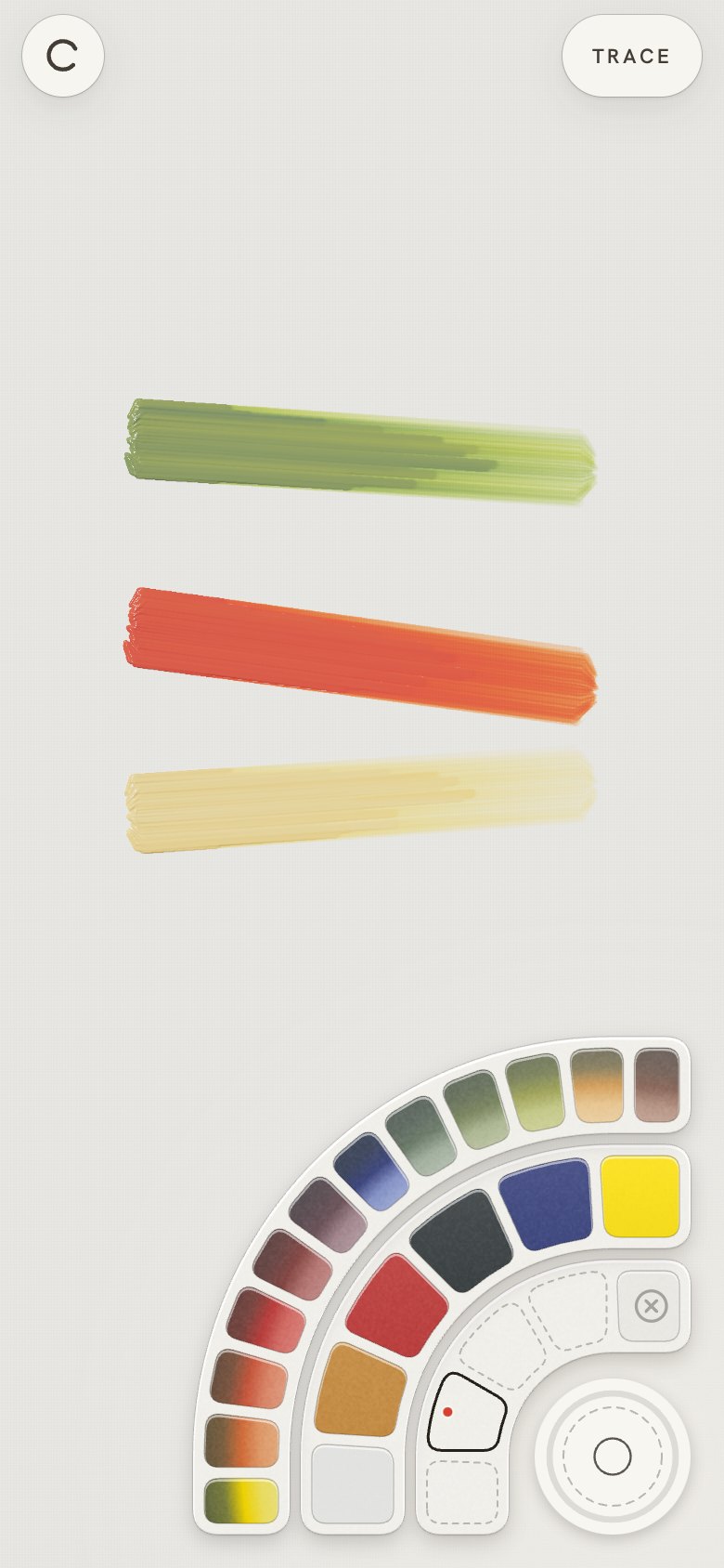
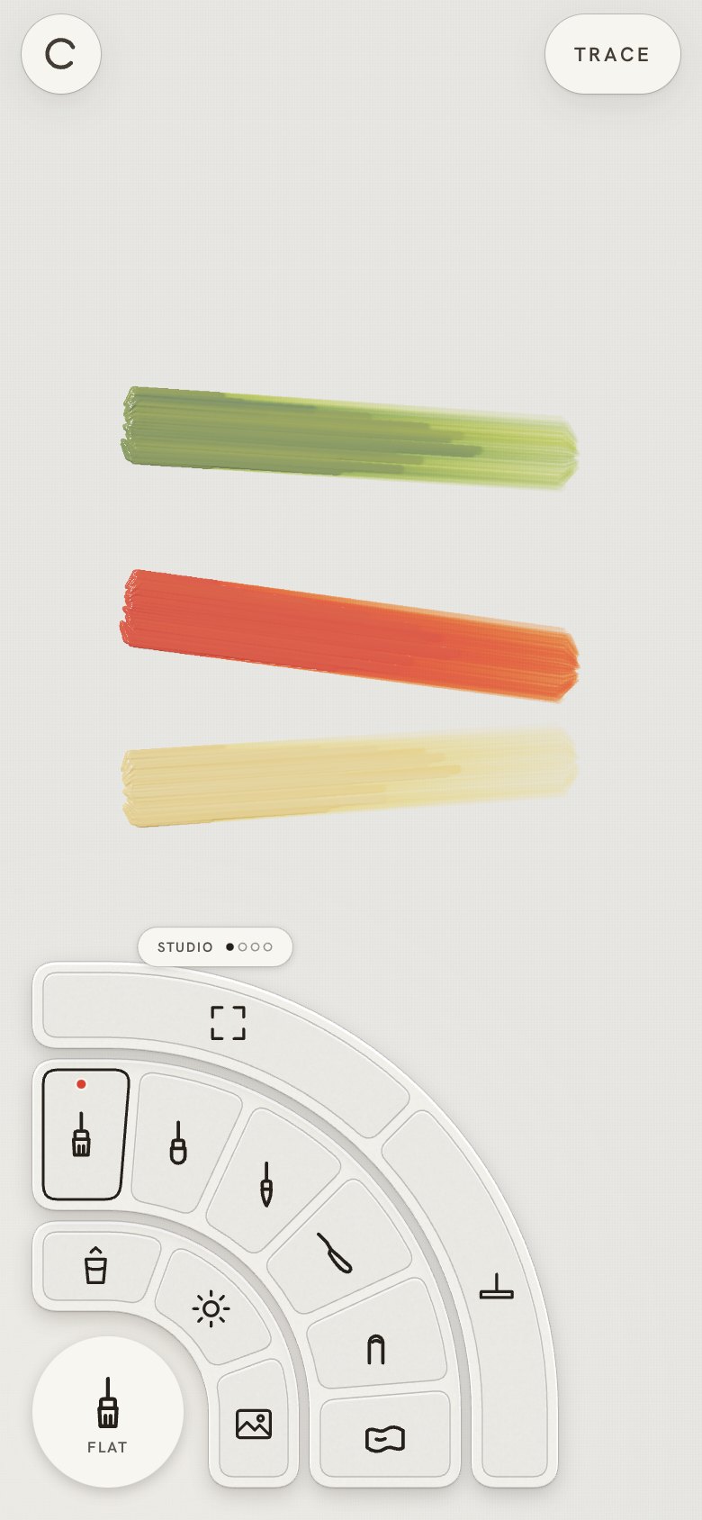
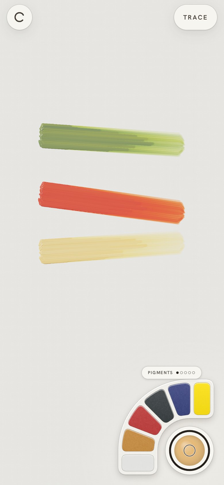
- "Why do we need the middle colour ring? Can we just use the outer ring, and add the swivel to
show more colours?" One ring now, swivelling between Pigments, Warm shades, Cool shades, and
Saved colours ("have more saved colours by swiping and rotating": twelve across two sets, kept
between visits). A pigment adds a part to the brush; a shade or a saved colour starts the brush
with it; a drop flies into the well.
- "The floating text on which colour I picked is nice, but it stays too long; why not use the
tooltip?" The result ("Cadmium yellow · 1 Ultram + 2 Cad yel") shows in the tooltip for a moment.
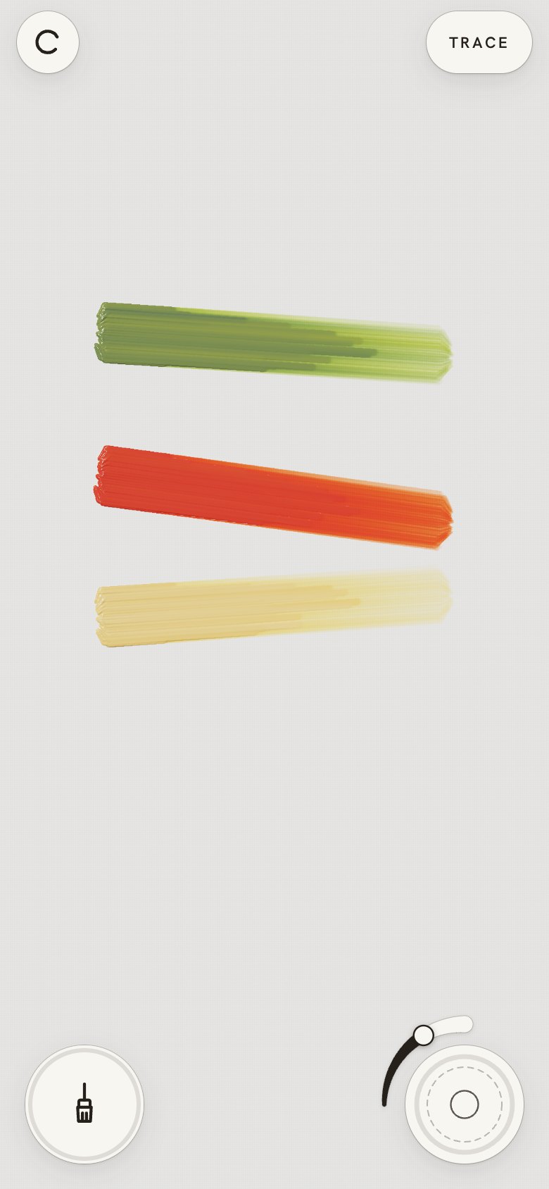
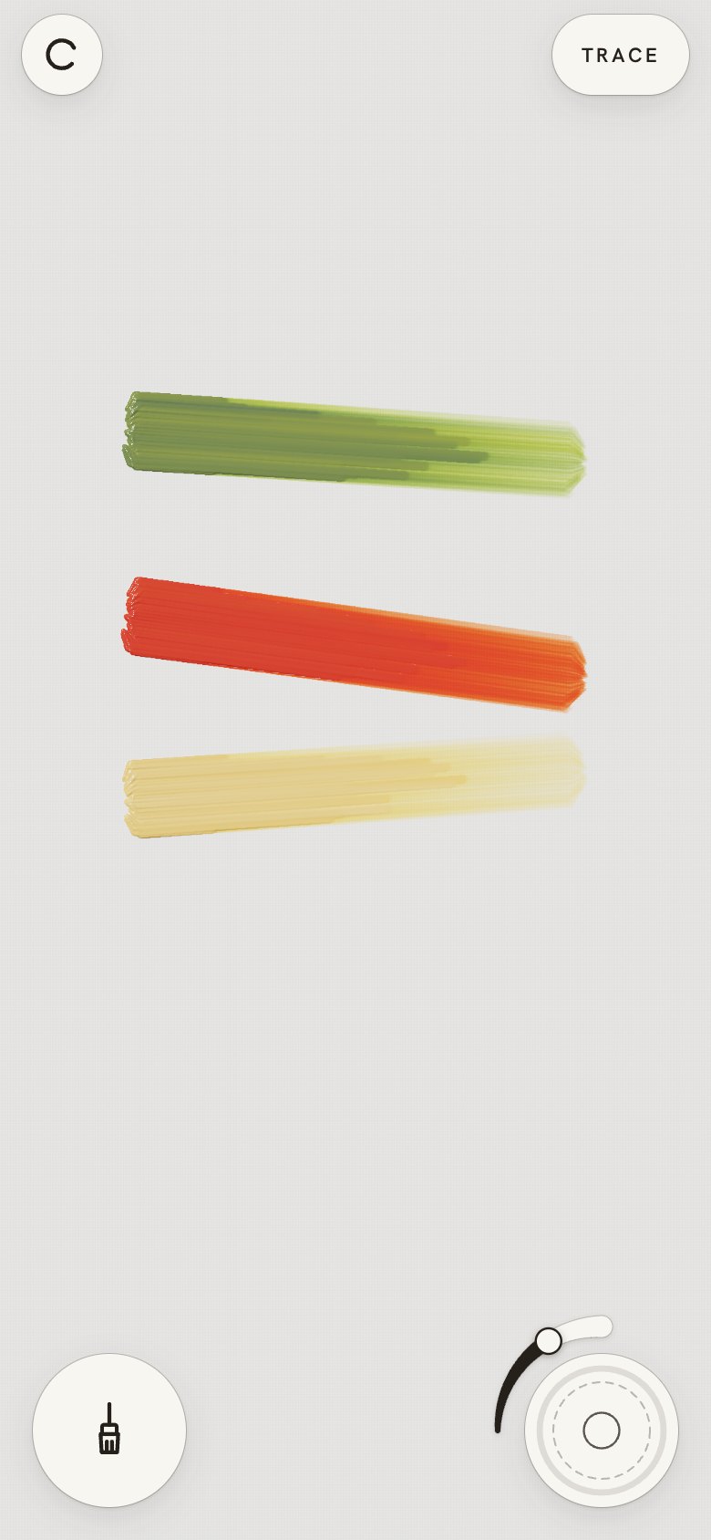
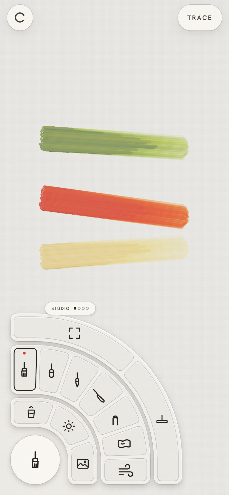
- "I'd like to control the brush size more easily." A size arc beside the right well, thin to
thick: slide along it, or tap a point.
- "Remove the brush labels"; "the two circles need an outline like all buttons."
- "Trace mode: collapse the menu so people can work": the trace controls fold to one button
once painting starts.
- "Can I use air to affect the colour on the canvas? … love to see it in action": the Air tool.
A finger says where; blowing at the phone (the microphone's loudness) says how hard, and wet
paint runs out in fingers. Without a microphone, holding the finger still blows.
| The screen, with the size arc |
Colours |
Tools |
 |
 |
 |
11 · Saved mixes inside, colours swivelling around them; trace crop
- "Brush size, nice."
- "The two radials need a similar visual language: add a line 2 px from its edge to look like the
right one." The tool well has a grey ring 2 pt inside its edge, like the brush well's.
- "On the colour rings, keep the first saved-mixes ring and have the scrolling colours around it."
Two rings again: saved mixes inside (six at a time, drag for the next six), and around them the
colours, swivelling between Pigments, Warm shades and Cool shades.
- "When the user loads an image to trace, they should be able to crop it." A crop step under a
frame the shape of the canvas: drag to move, pinch to zoom, Use. Crop in the trace controls
changes it later.
- "Remove the air interaction, it feels odd": removed, microphone and all.
12 · A selected colour, matching wells, New canvas
- "Ring 1 (closest to the circle) always has one selected; a tap on the outer ring adds to the
selected colour mix, like it used to." "Outer ring affects inner ring, inner ring affects the
circle." Ten stored colours inside (five a set, drag for the rest) and ✕ to clear; each tap
outside, pigment or shade, adds a part to the selected one, which goes on the brush.
- "Let's have the left ring look like the right ring (size, two inner lines)": the tool well has
the brush well's track ring and inner circle.
- "How do I erase all?" New canvas in the tool ring's Studio set, with a second tap to confirm.
13 · Seven brushes, and a canvas circle top right
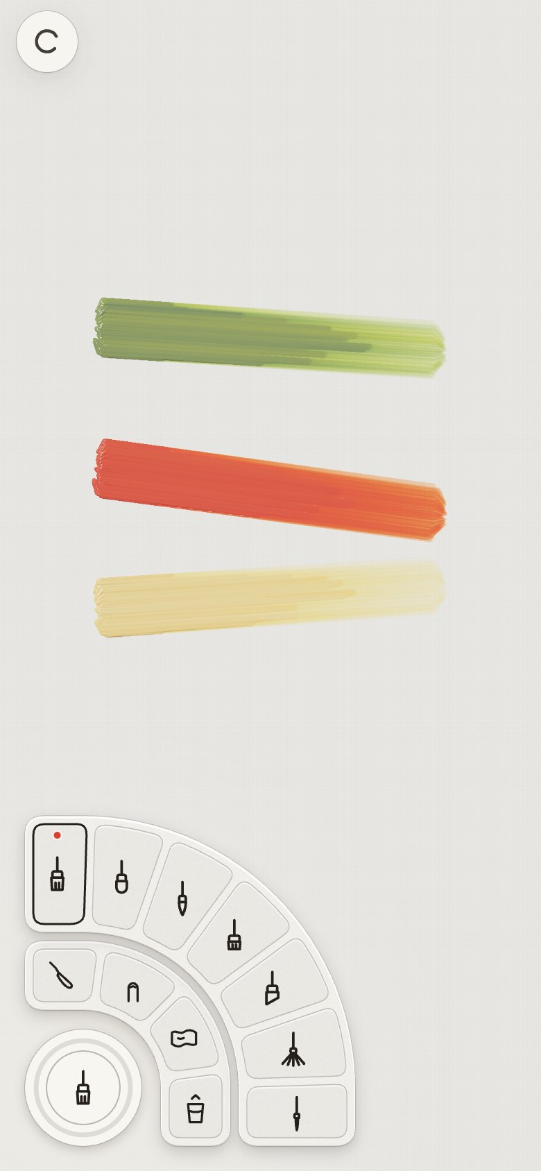
- "Do we need the squeegee?" → removed. "Prefer a wider set of brushes": bright, angle, fan and
rigger join flat, filbert and round.
- "Global operations should not be in the brush menu but on another circle, top right, like new
canvas, trace." A third circle in the same language: New canvas, Trace, Dry, Fit inside; Light,
Finger and Surface settings swivel around them. The tool circle keeps brushes and tools only.
- "The distance from the finger should be further, and relate to the brush size": the nib sits
44 pt above the fingertip plus half the brush's width.
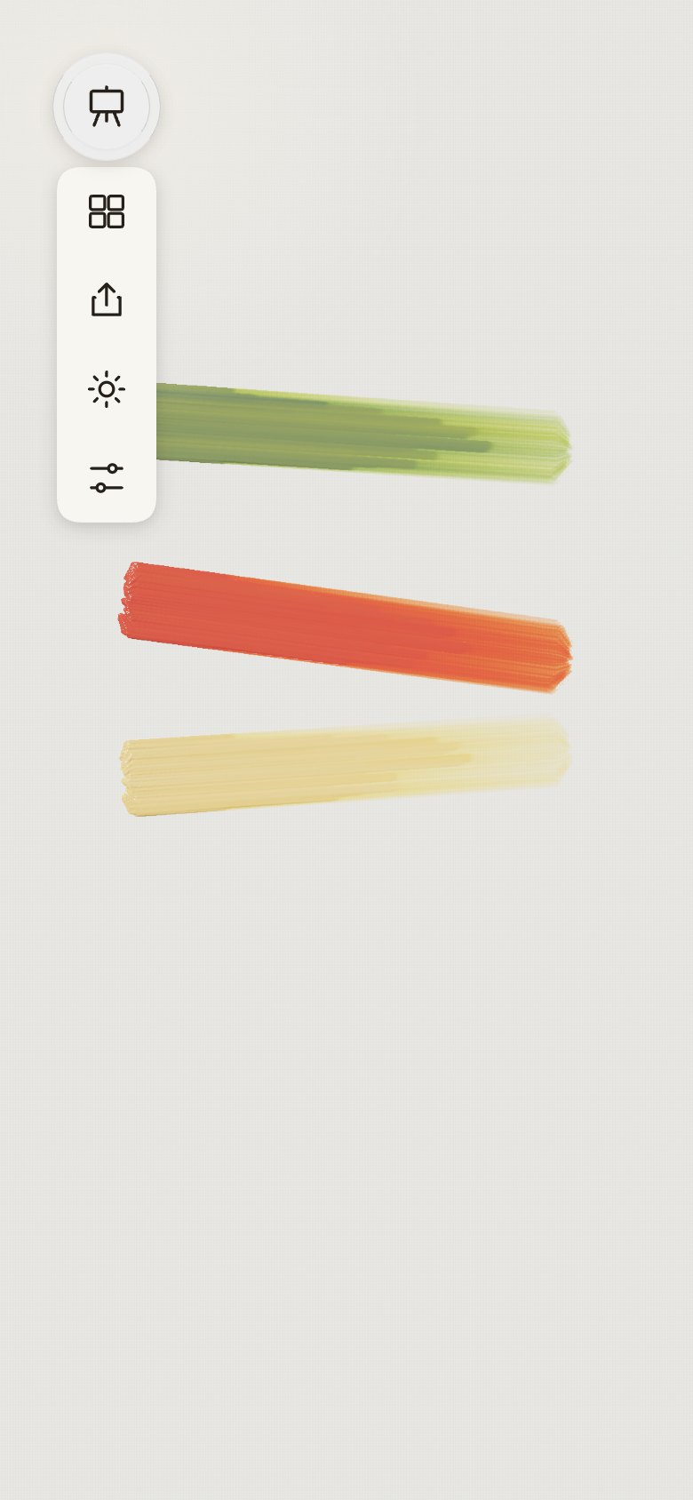
14 · Top corners: a canvas menu and a view column
- "Outer ring: why would this be upfront? Keep tilt selected, and see if we need this." The
Light, Finger and Surface settings left the rings. They stay in Settings; the app keeps tilt
lighting on.
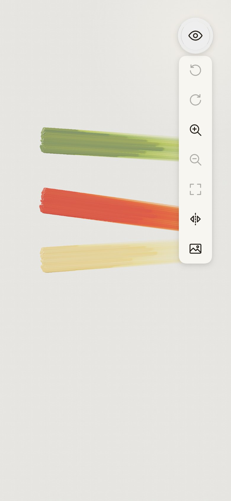
- "Maybe add redo beside undo. Fit does not belong there, it is a view option; a new menu top left
with new canvas, settings", then "the top left menu also with redo, undo, and keep top right fit,
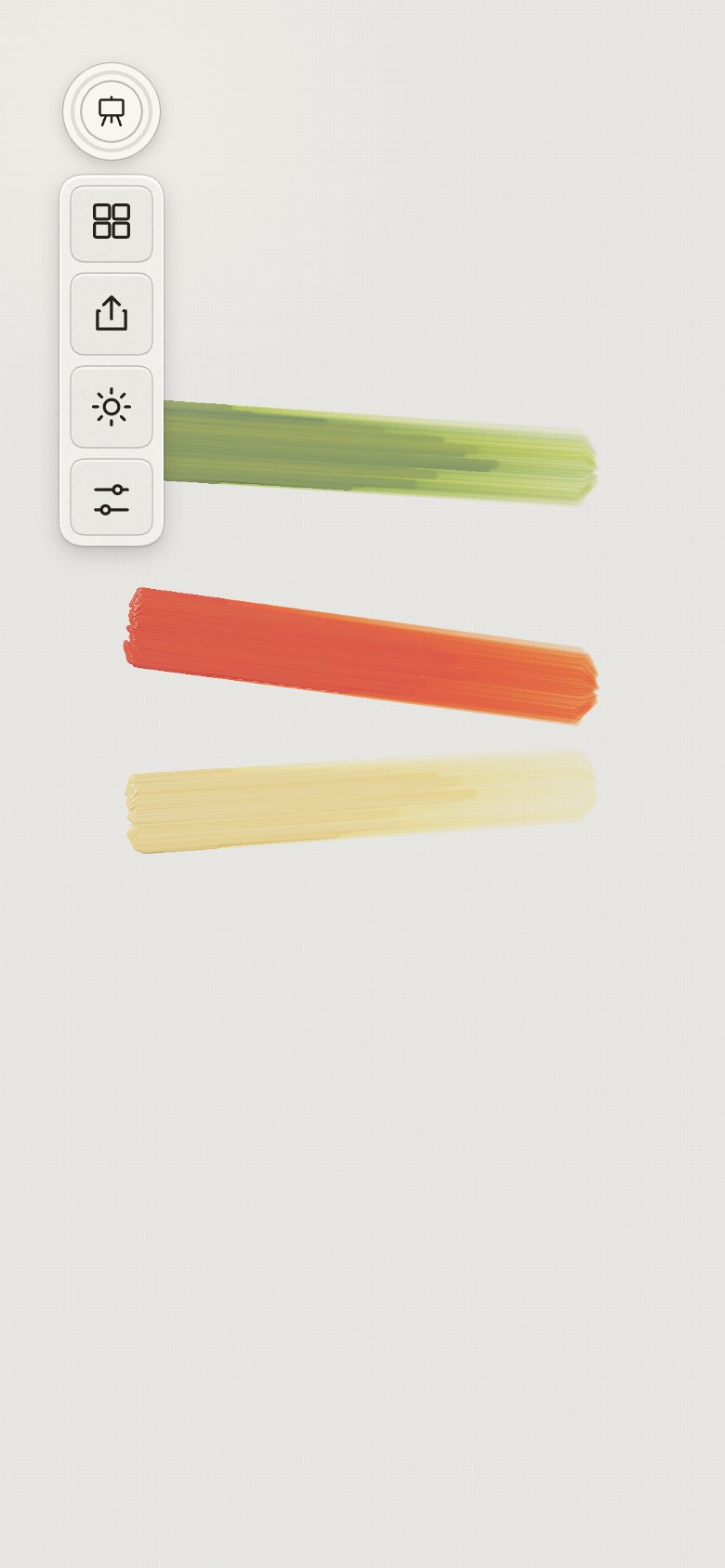
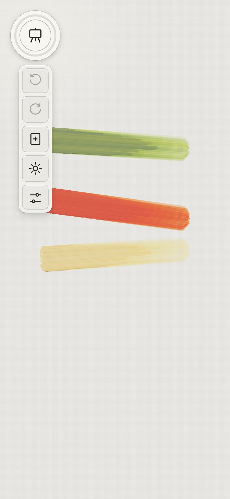
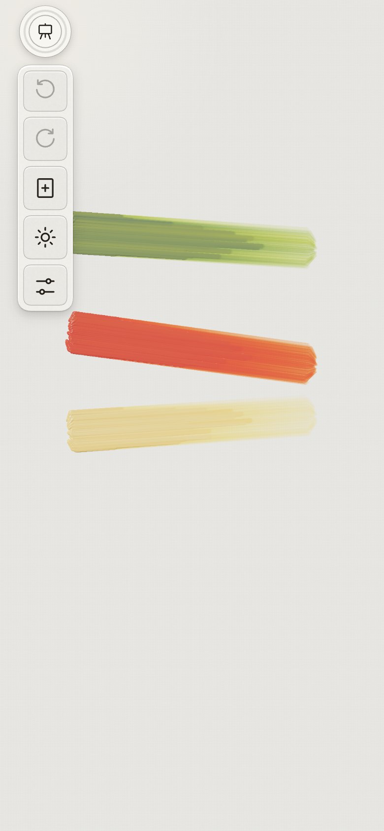
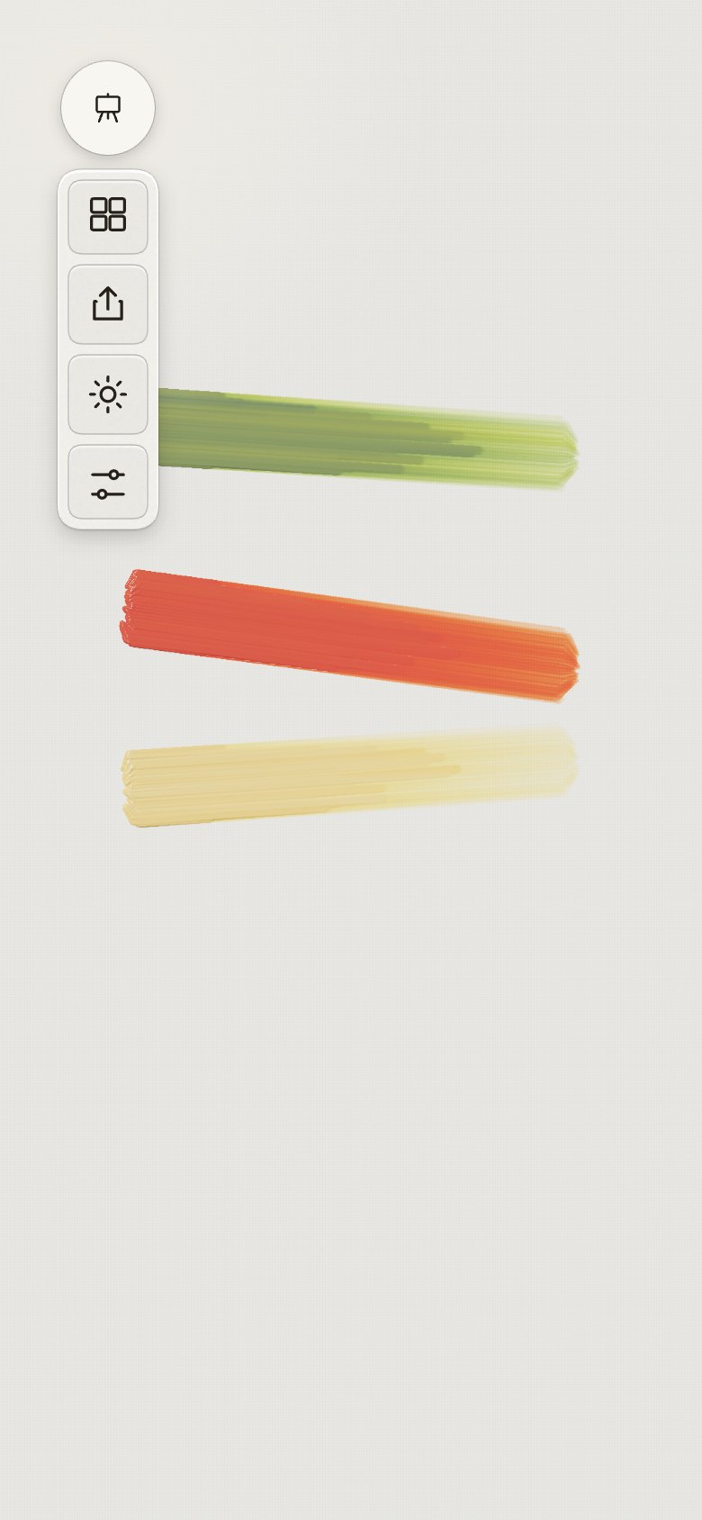
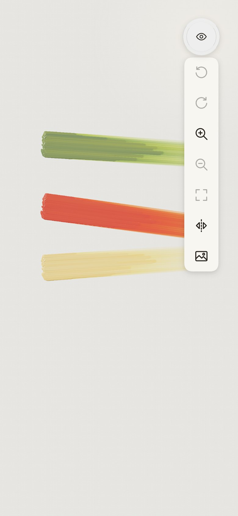
zoom in". Top left, the canvas (easel): undo, redo, new canvas, let it dry, settings. Top right,
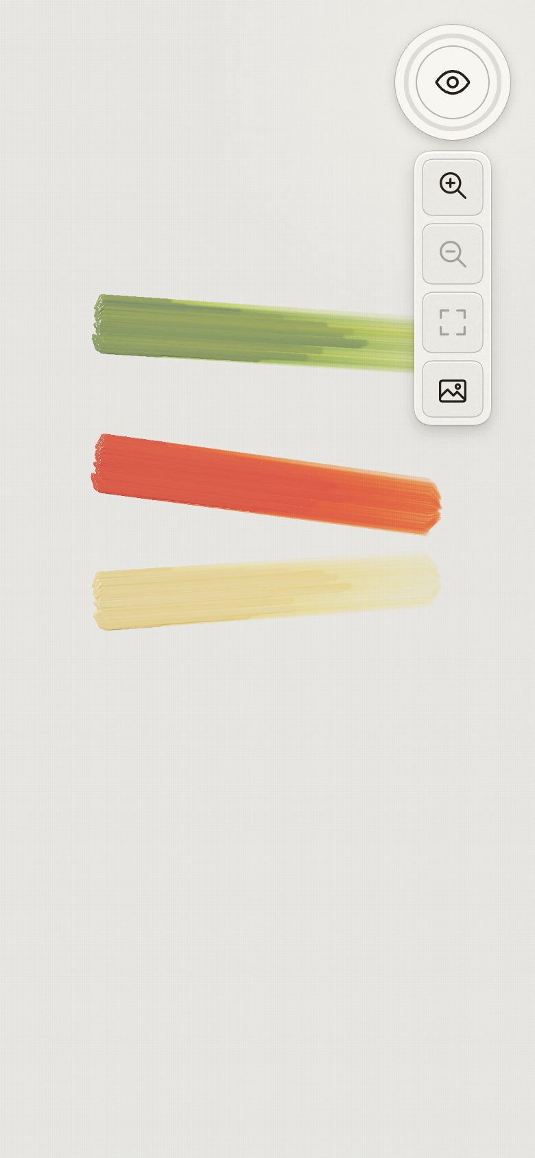
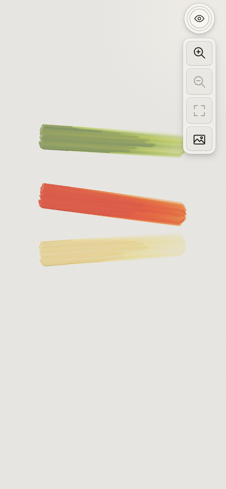
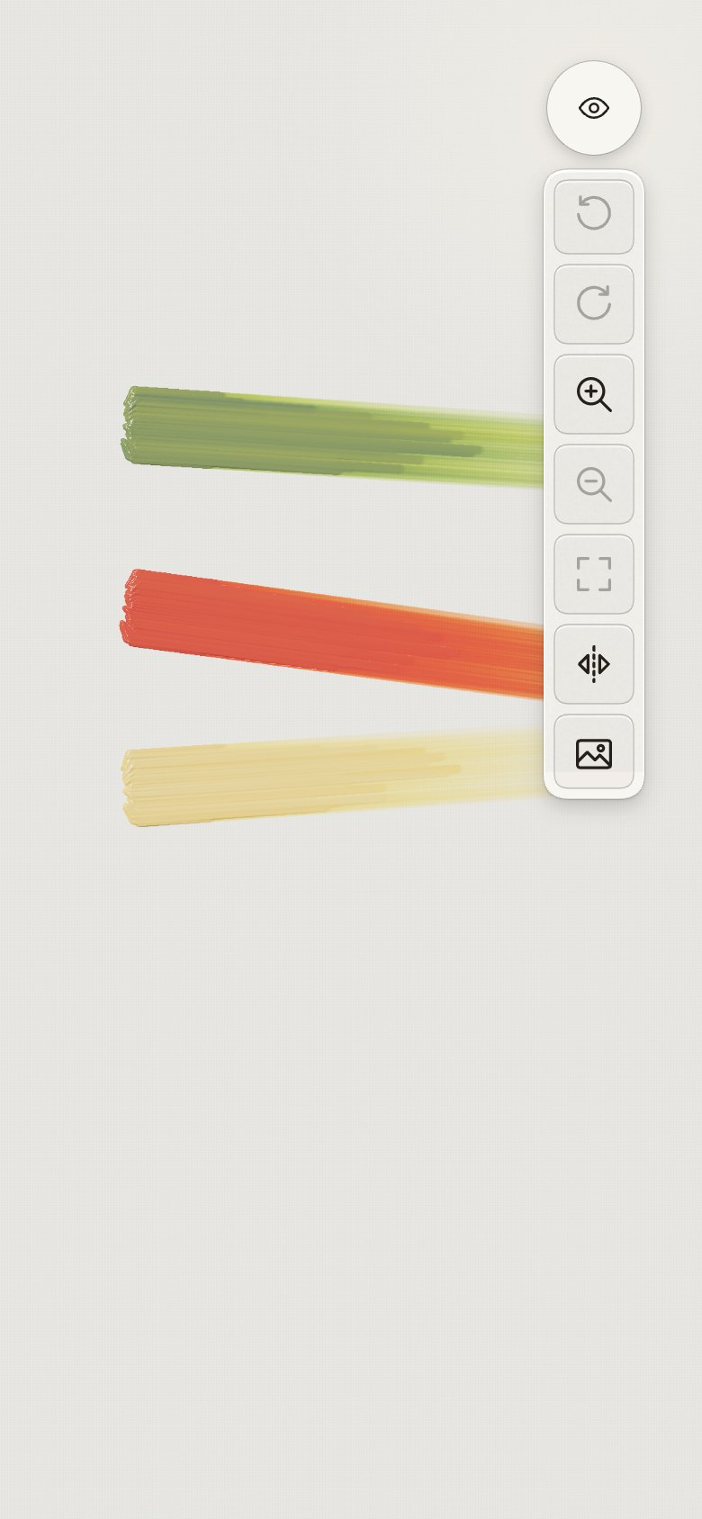
the view (eye): zoom in, zoom out, fit, trace.
- "These two will collide with the iPhone camera; maybe they do not need to be radial, but a list
of icons, single row down?" The top wells open a single column straight down, built on the same
track as the rings (an arc of no length), so the raised paper, tiles, tooltips and
press-and-slide are the same as the bottom wells.
- Hints became the ring labels' pill: "this should use the same label as the one above, even if
it's transient."
| Canvas menu |
View |
 |
 |
15 · The top wells move into the camera's row
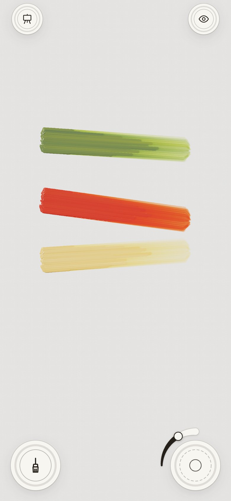
- "Try to move the two top circles to be at the top row of the phone." The canvas menu and the
view sit either side of the camera, where the clock and battery would be, as 52 pt wells on the
camera's line. The screen's top strip, empty since the status bar is hidden, now holds them, and
the painting gets the room they took.
- "Make the padding from the top same as from the sides": 18 pt each way, as the bottom wells sit.
Then "middle-align each top circle to the one directly below it": each top well is centred over
its bottom well, 34 pt in from the side and 34 pt down from the top.
| The screen |
Canvas menu |
View |
 |
 |
 |
16 · Earths, a painting that keeps, a colour you can pick up
From the five reviews (Reviews), the owner chose four ("do 1, 3–5"), and added
"remove sway" and "allow me to move my finger over brushes and see tooltips".
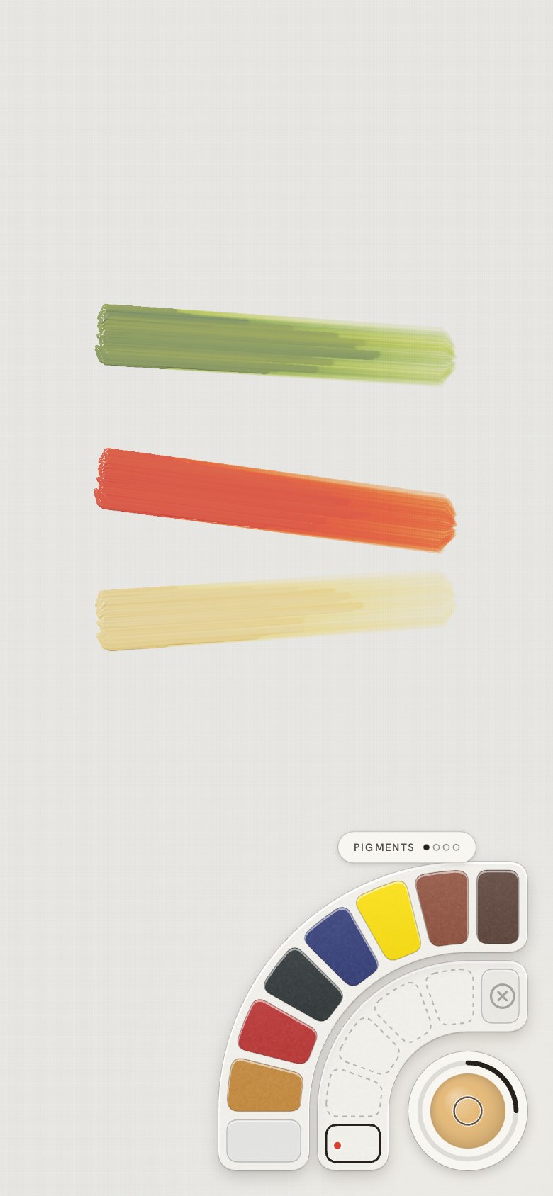
- Burnt sienna and burnt umber join the Pigments ring, eight colours now. They fit the memory
the six used: the oil content moved to its own small array.
- Paintings keep themselves, and Your paintings joins the canvas menu (top left): a grid,
newest first. New canvas keeps the old one, and a painting picked up after a long break has
dried, as Nijimi's canvas does.
- Touch and hold still on the canvas picks up the colour under the nib into the selected
stored colour, shown in a loupe.
- Value check and Mirror join the view column (top right).
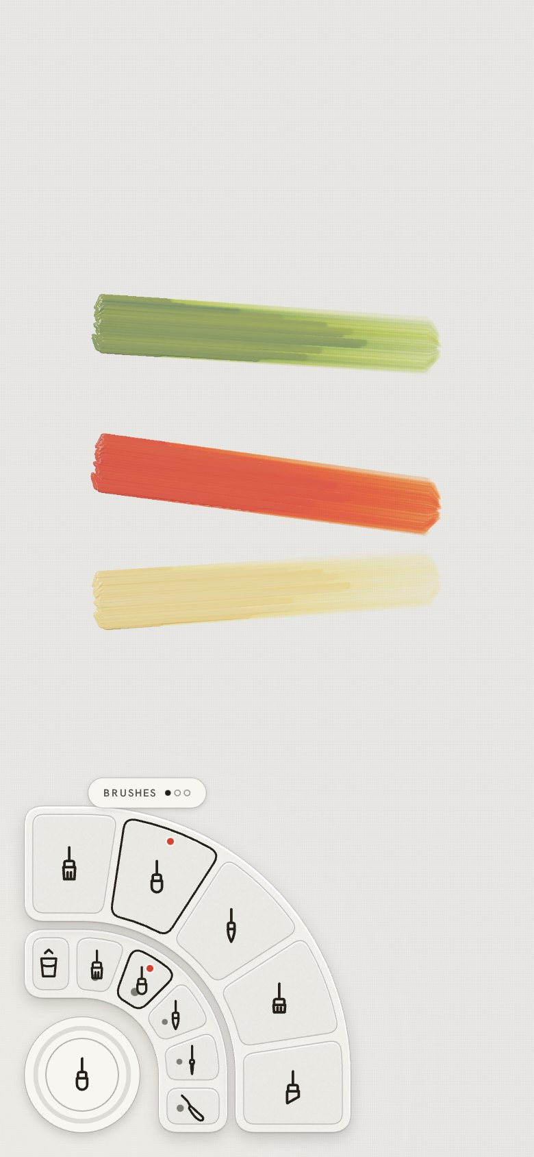
- Sliding a finger across the brushes shows each one's name in turn, the tile under the finger
sinks, and lifting picks it.
- Sway is gone: the light moves only when you tilt, or stays where you put the lamp.
| The screen |
Colours |
Tools |
Canvas menu |
View |
 |
 |
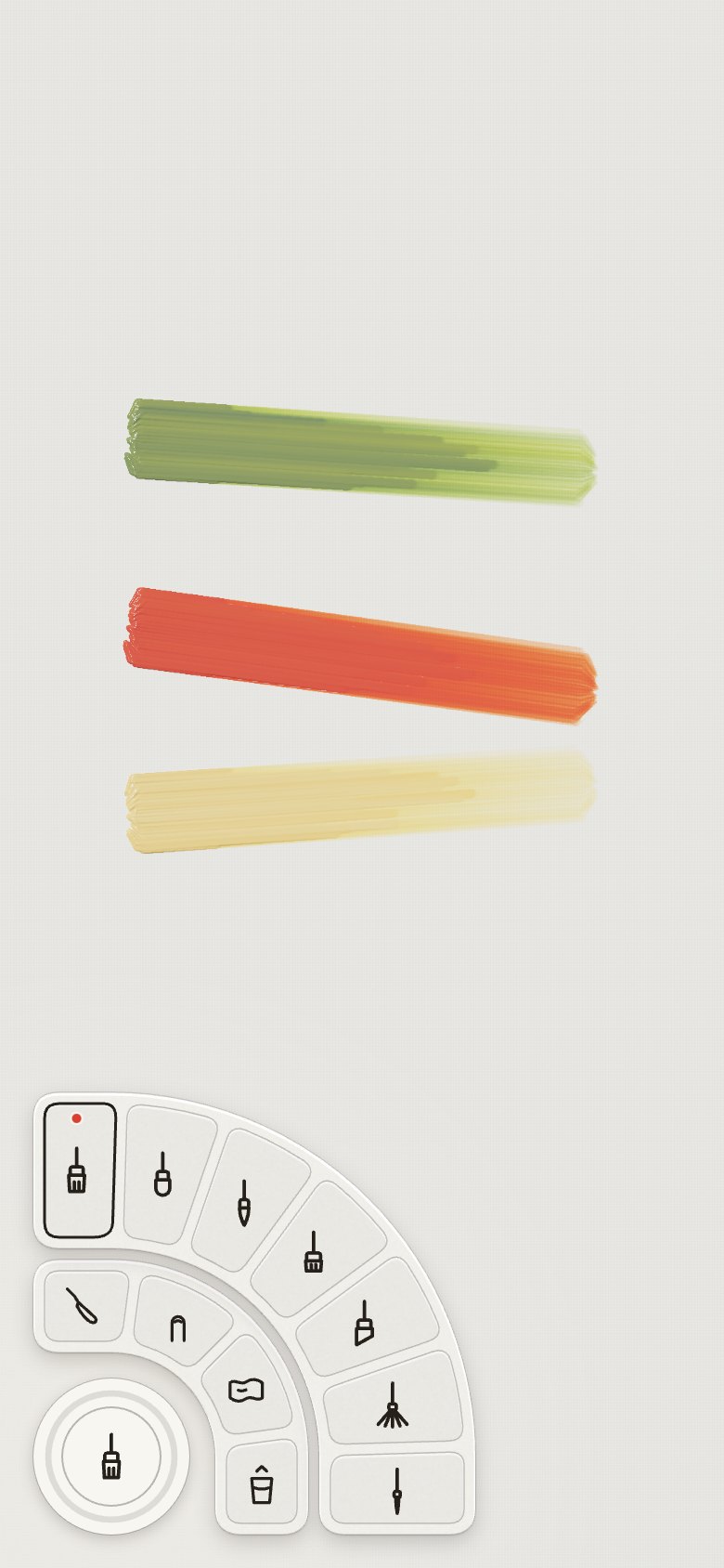 |
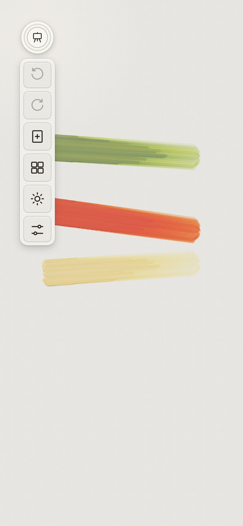 |
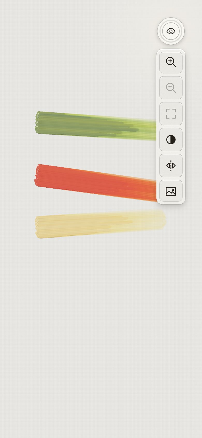 |
17 · Names, a nib to the thumb side, a painting saved as an image
- The UX architect's taxonomy: Mixes, full pigment names, Ready mixes, the Zorn
palette, Clean the brush first, and Settings trimmed to Studio.
- The nib turns 45° toward the thumb side, its ring shows on touch-down, and it comes home at the
edges. Twist to aim was built, compared, and removed ("too much work, hard to discover").
- The controls step away while painting. Save as an image joins the easel and the gallery.
18 · Your brushes, as your mixes
- "Are we missing brushes? We can use the same system: first ring to save brushes, second ring to
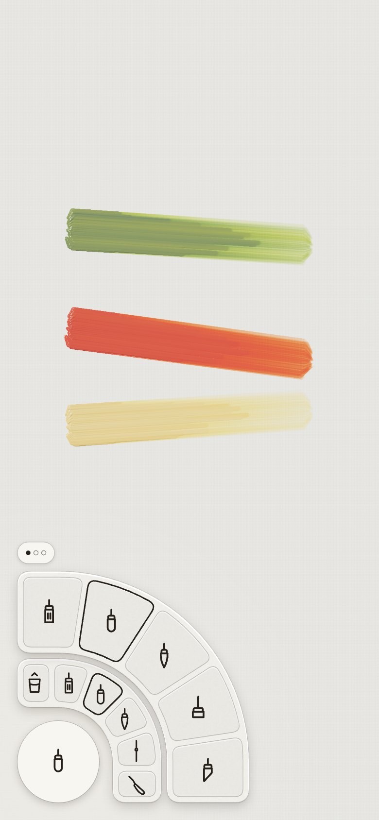
browse." The tool ring now mirrors the colour ring: inside, Clean the brush and five of your
brushes, each with its size; outside, every brush in pages (Brushes, More brushes, Knife and
hands). The owner's sliding tooltips stay: this outer ring turns by its tab, not by a slide.
-
A soft mop and a dagger join the brushes: nine now.
-
Then New canvas moved into Your paintings, and Undo and Redo to the top-right column.
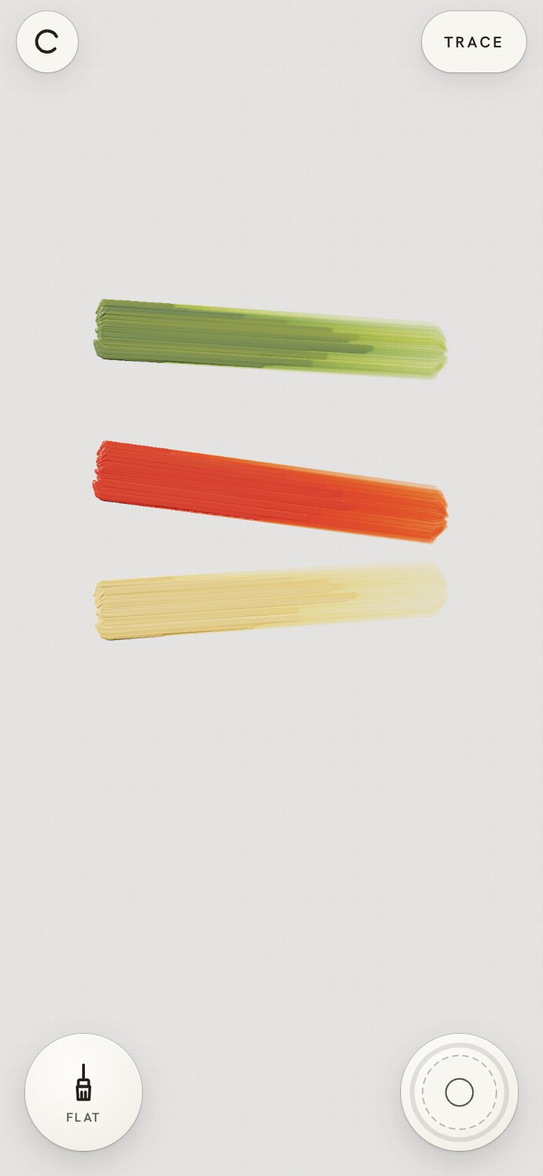
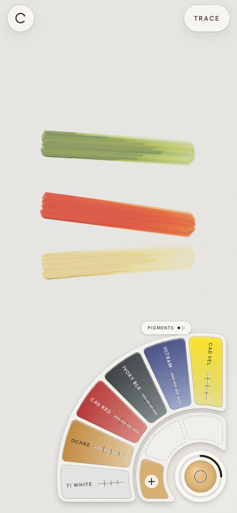
19 · Fresh paint every stroke, and plain wells
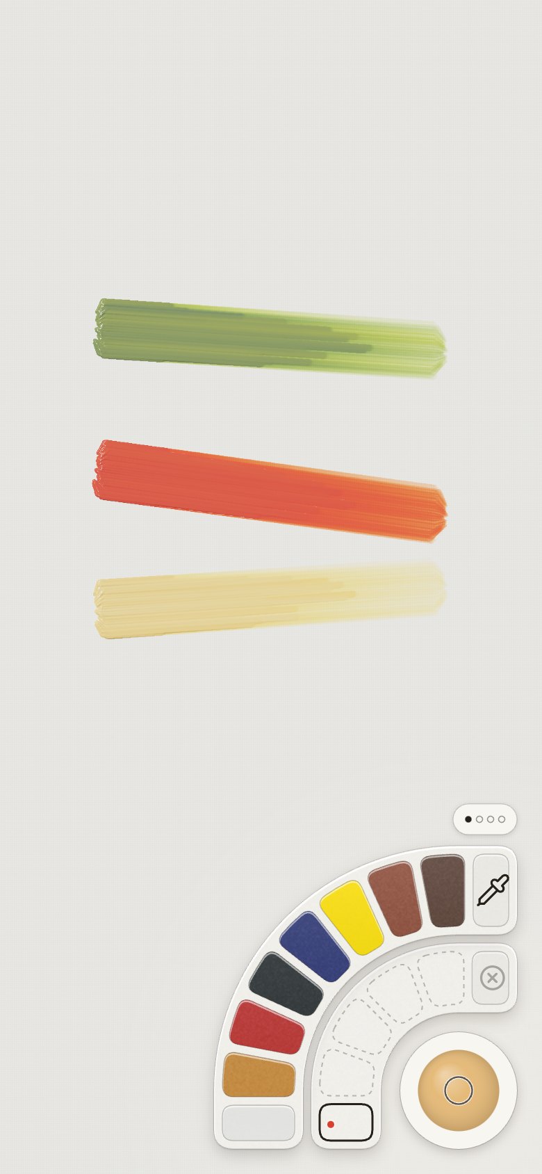
- "I think we need to rethink the idea of needing to refill the brush; it does not feel
intuitive." Every stroke now starts with fresh paint, and the colour well's tap opens the colour
rings (Refilling).
- "Considering that we hide the circles while drawing, it seems that we do not need the black ring
that runs out as users draw. Let's simplify." The gauge went, and the colour fills the well; it
shows the mix the next stroke will carry.
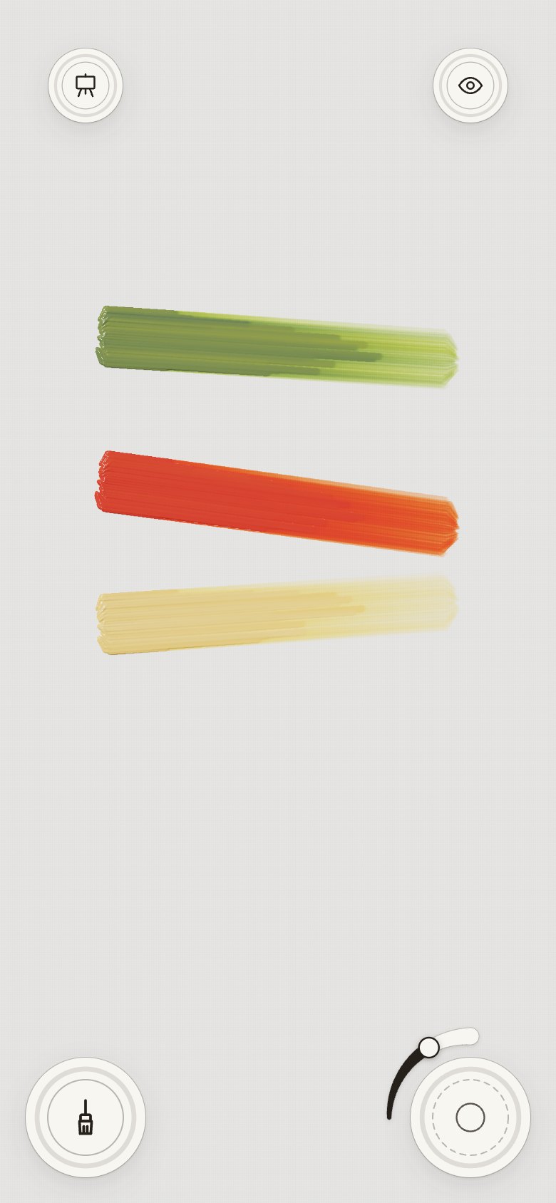
- "We do not need three ring buttons." The rings on the brush, easel and view wells, which copied
the gauge, went too: four plain paper circles.
| Screen |
Colours |
Tools |
Easel |
Right column |
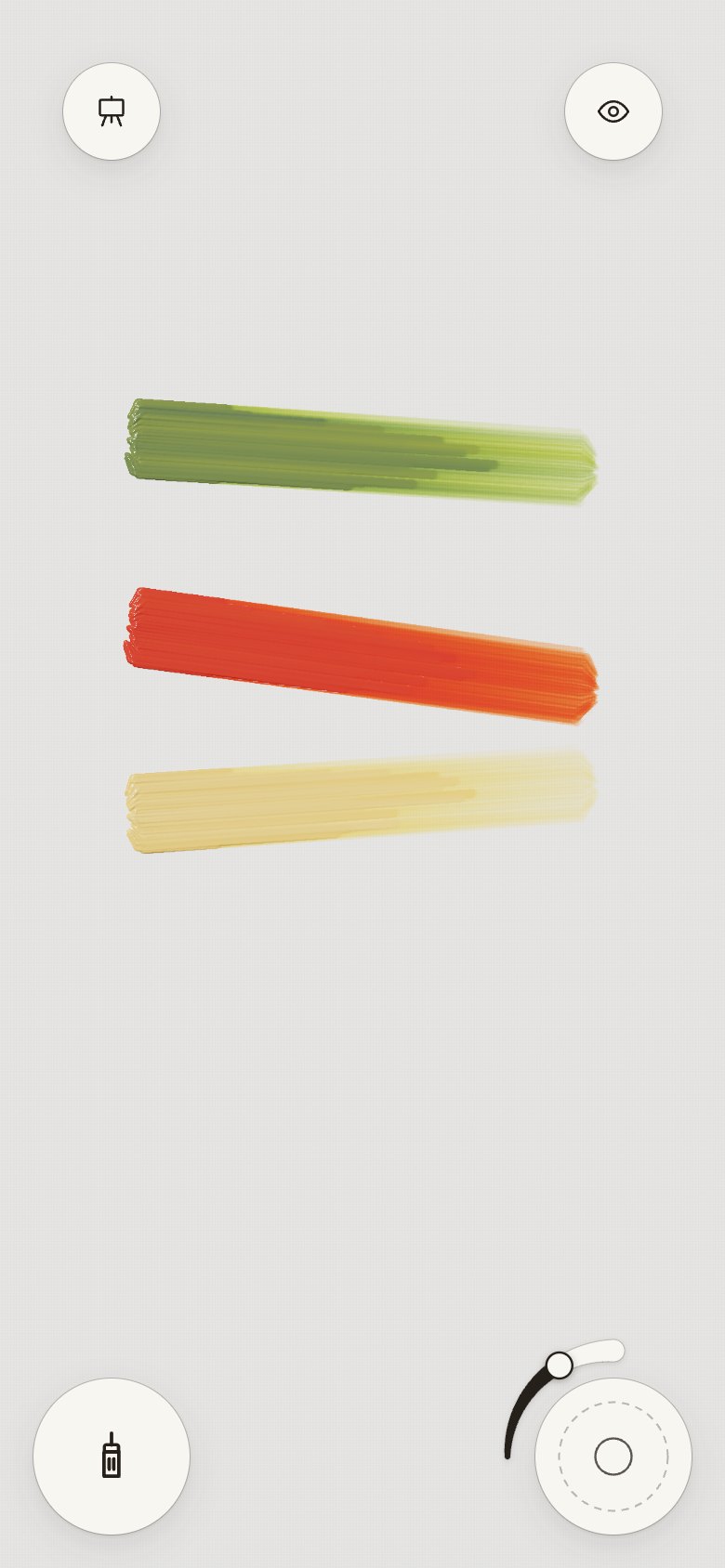 |
 |
 |
 |
 |
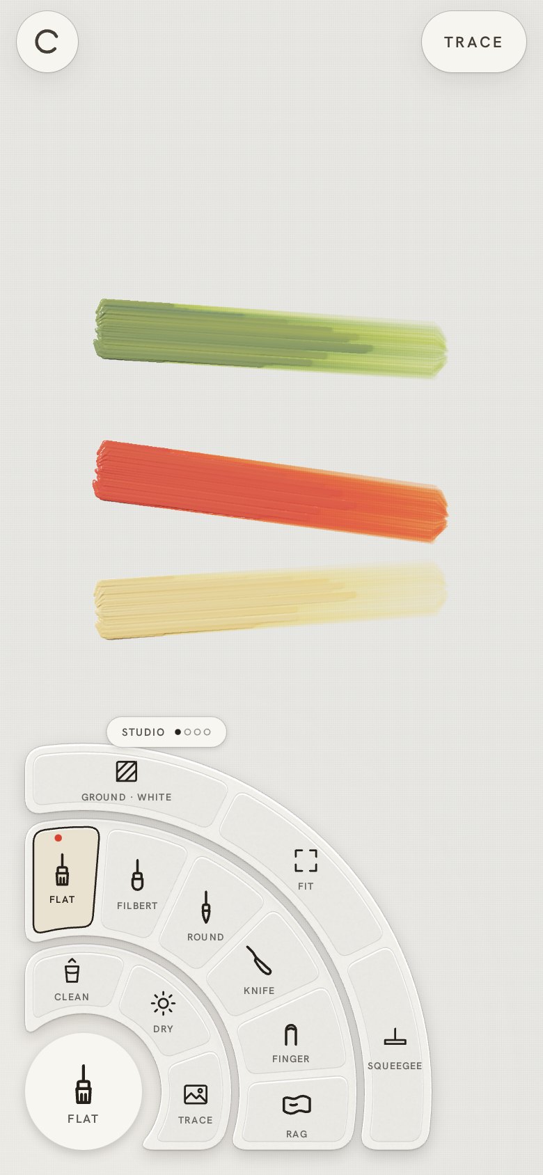
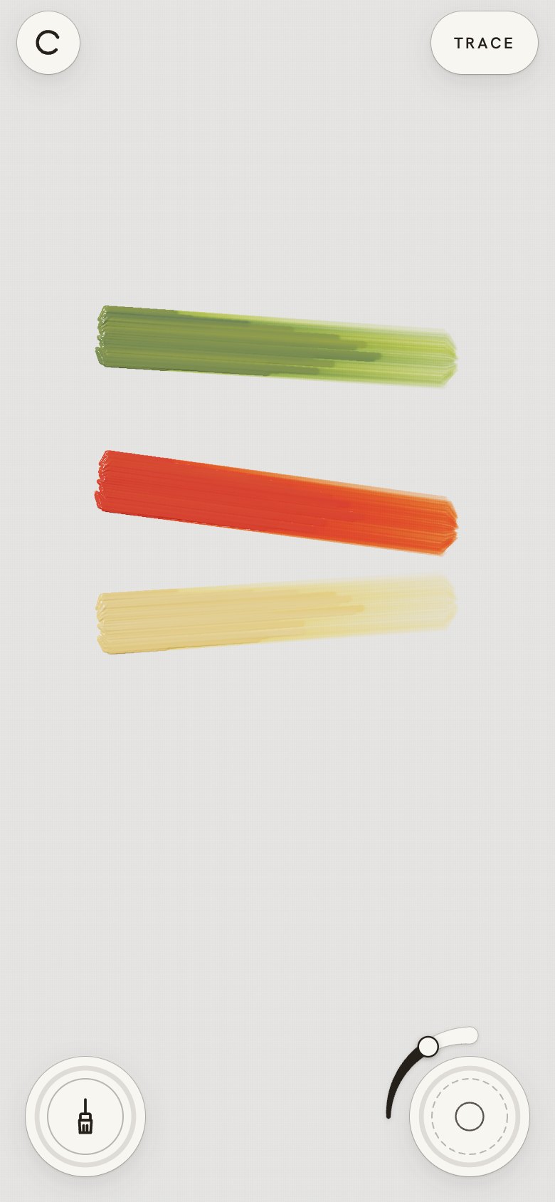
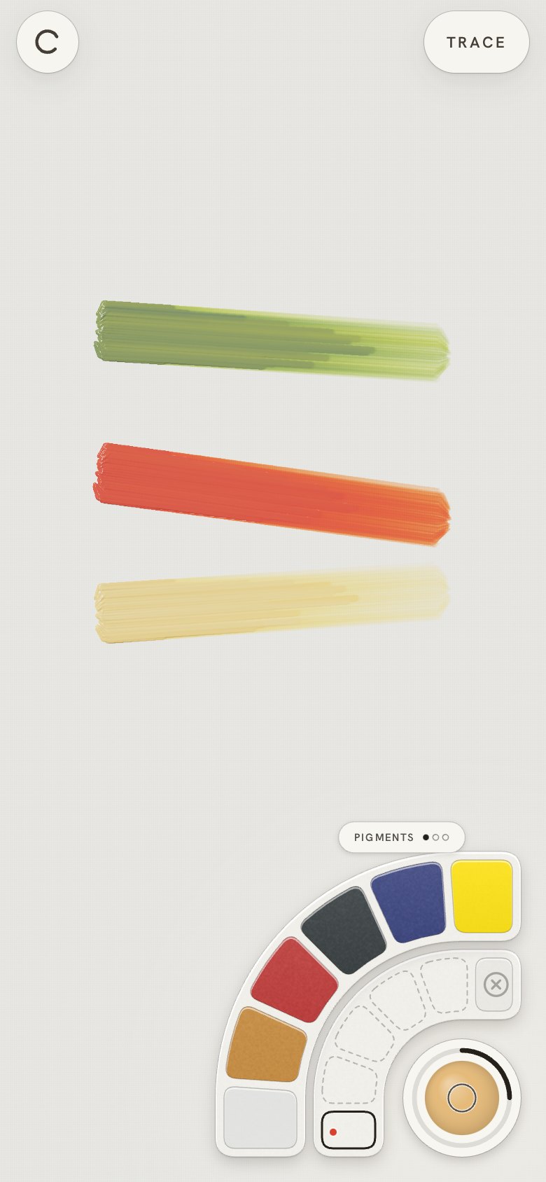
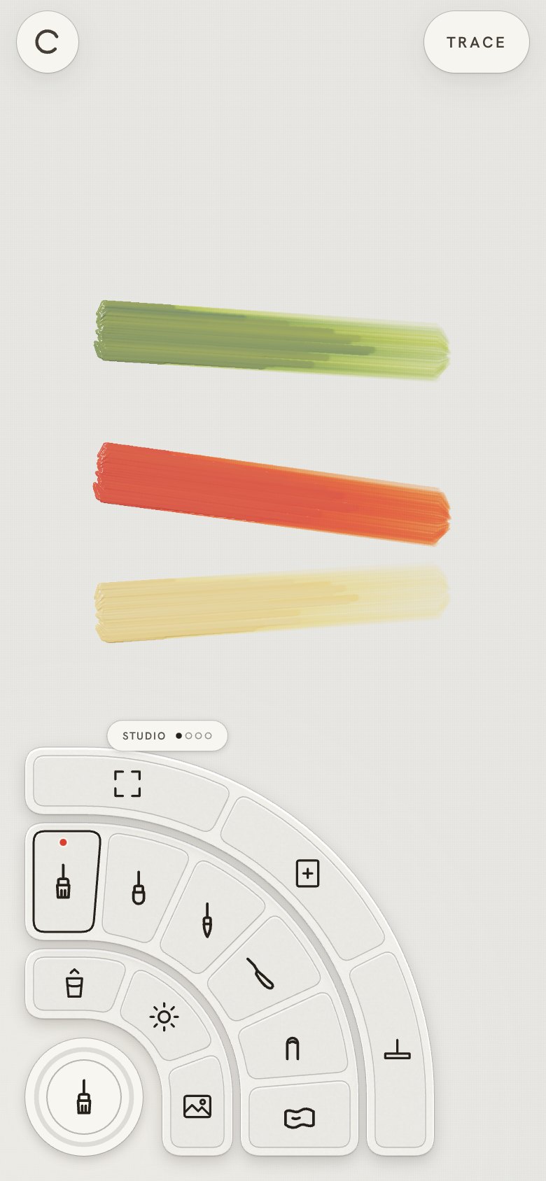
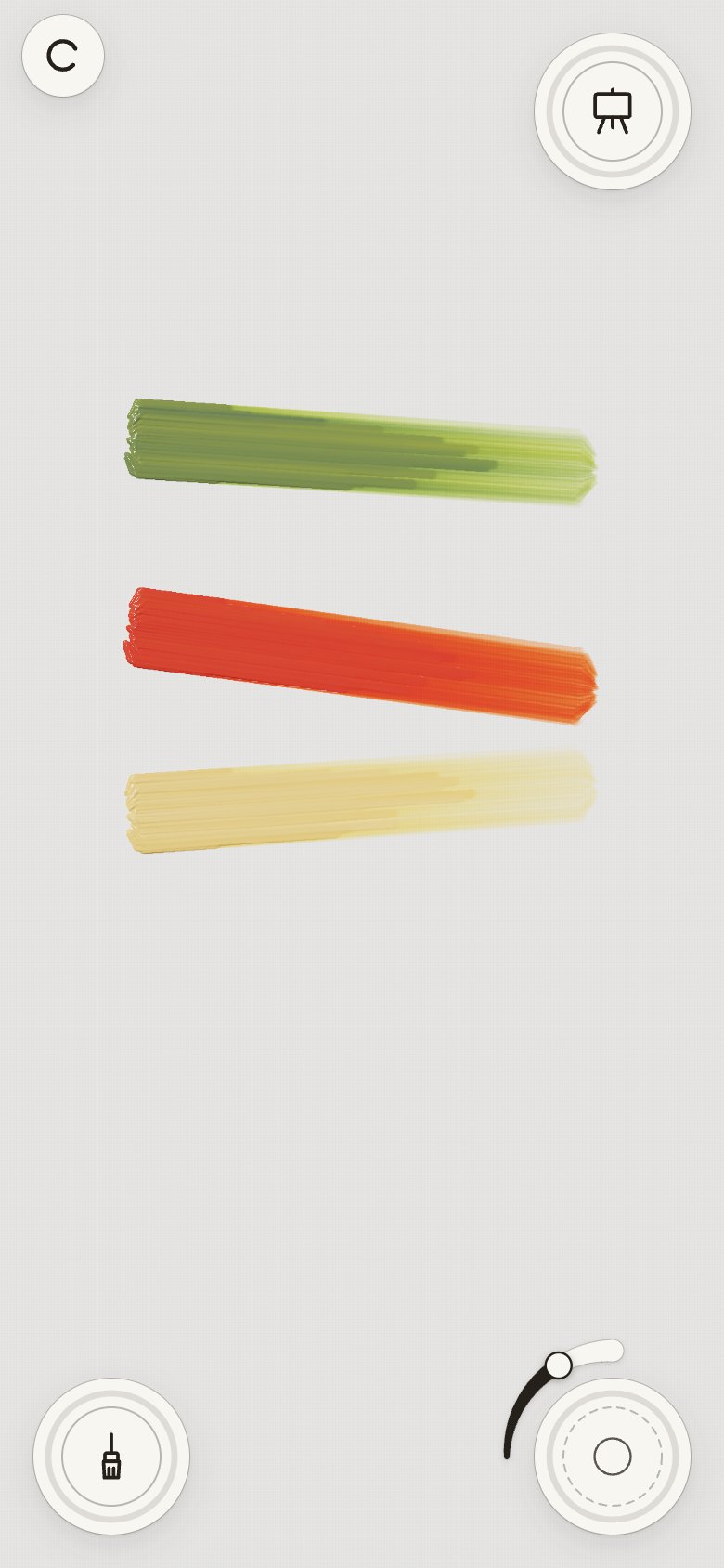
20 · Simpler
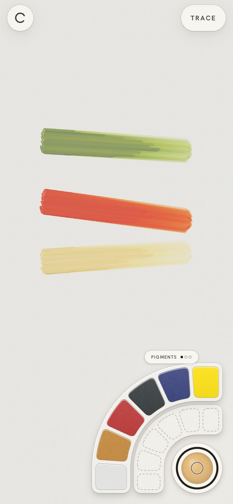
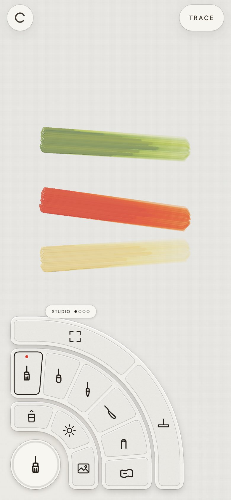
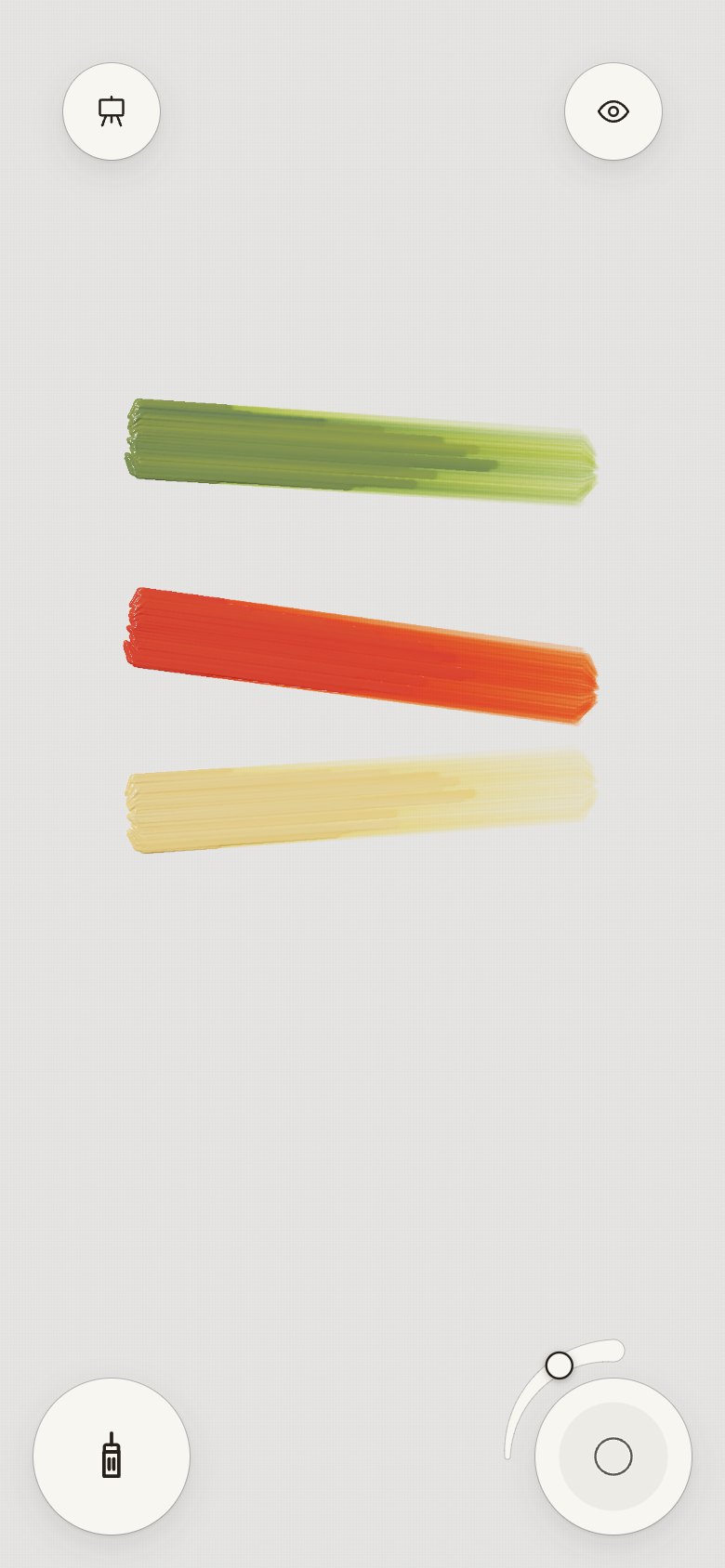
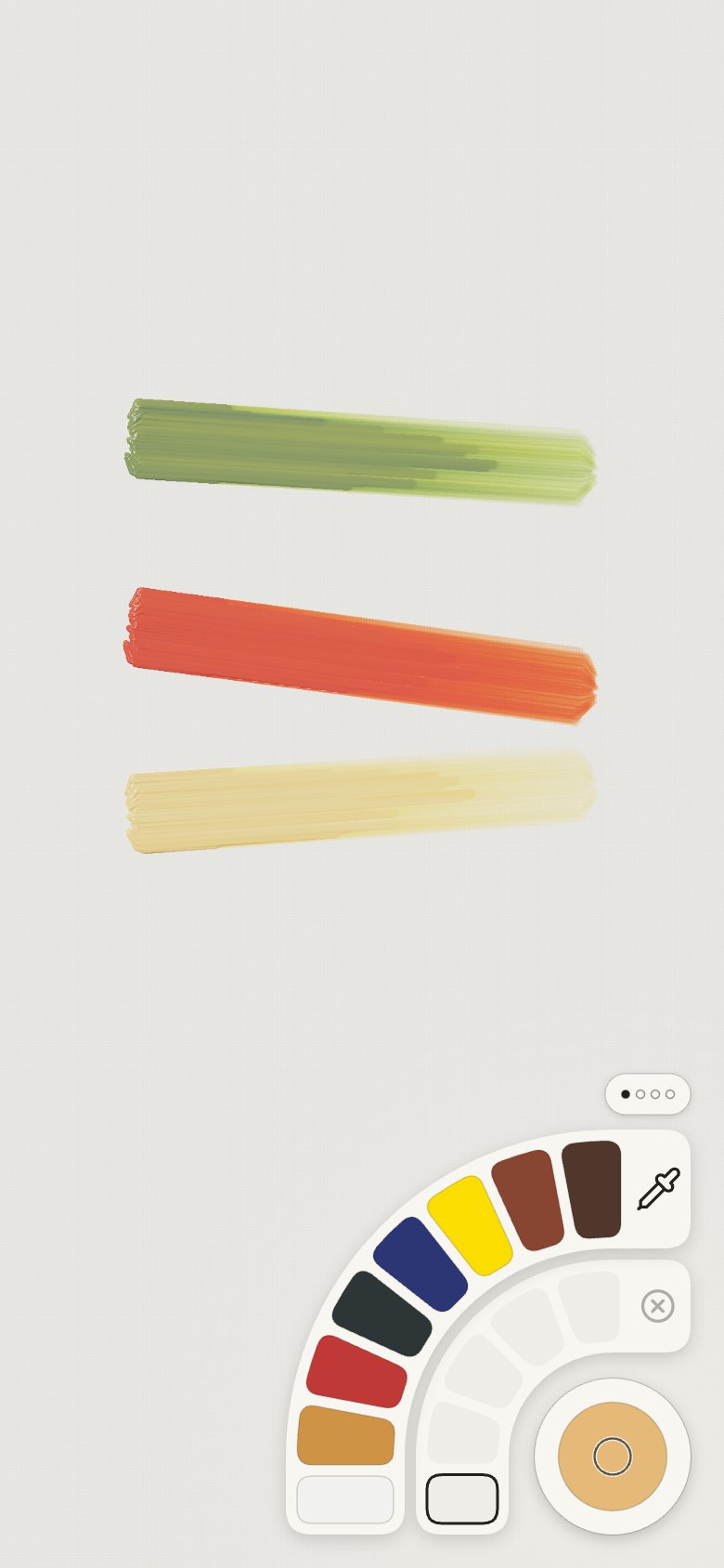
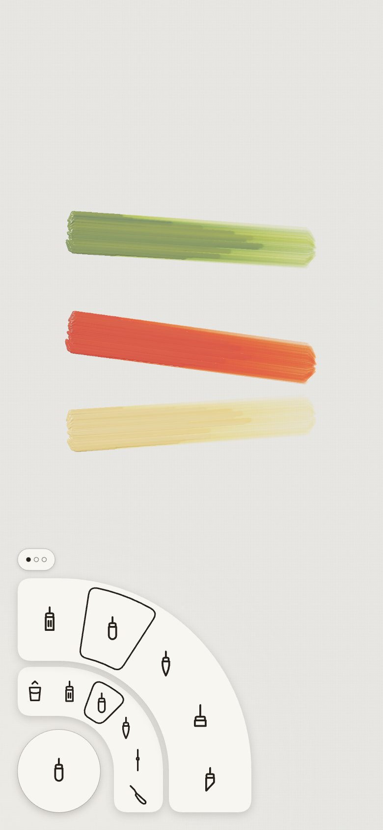
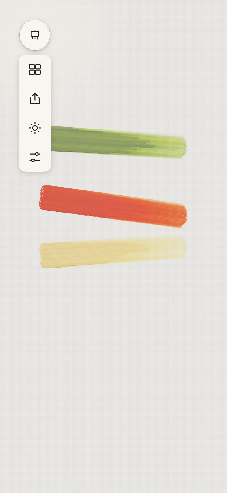
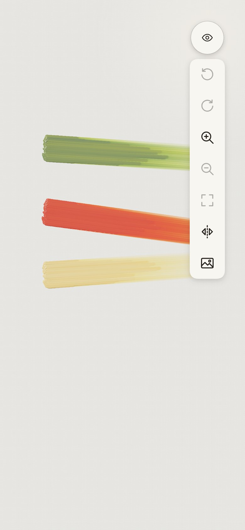
- "Simplify the visual design." One flat language: plain paper rings with one soft shadow, icons
straight on the paper without tile boxes, flat colour swatches, empty slots as faint shapes, the
selection a single ink outline (the red dot went), a flat colour in the well, and a quiet size
arc without its black fill. Grain, bevels, sheens, lit edges and dashed outlines are gone.
| Screen |
Colours |
Tools |
Easel |
Right column |
 |
 |
 |
 |
 |
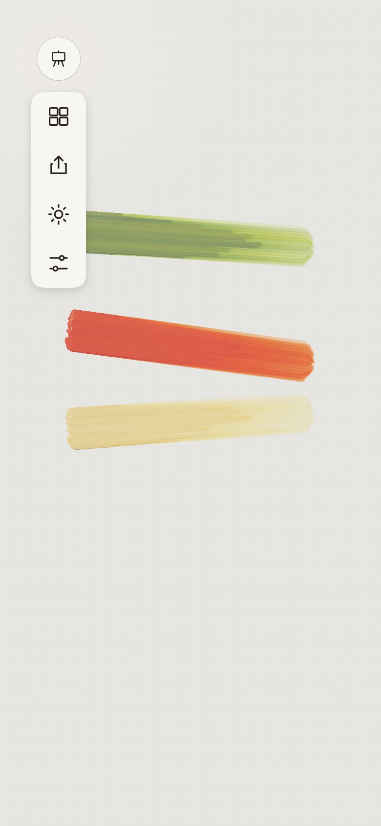
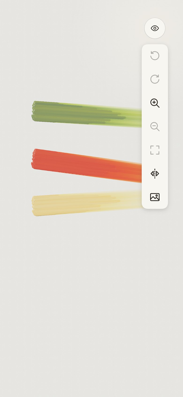
21 · iOS buttons
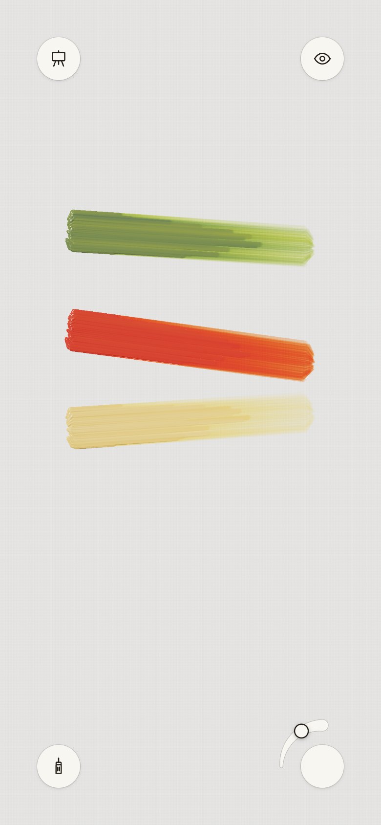
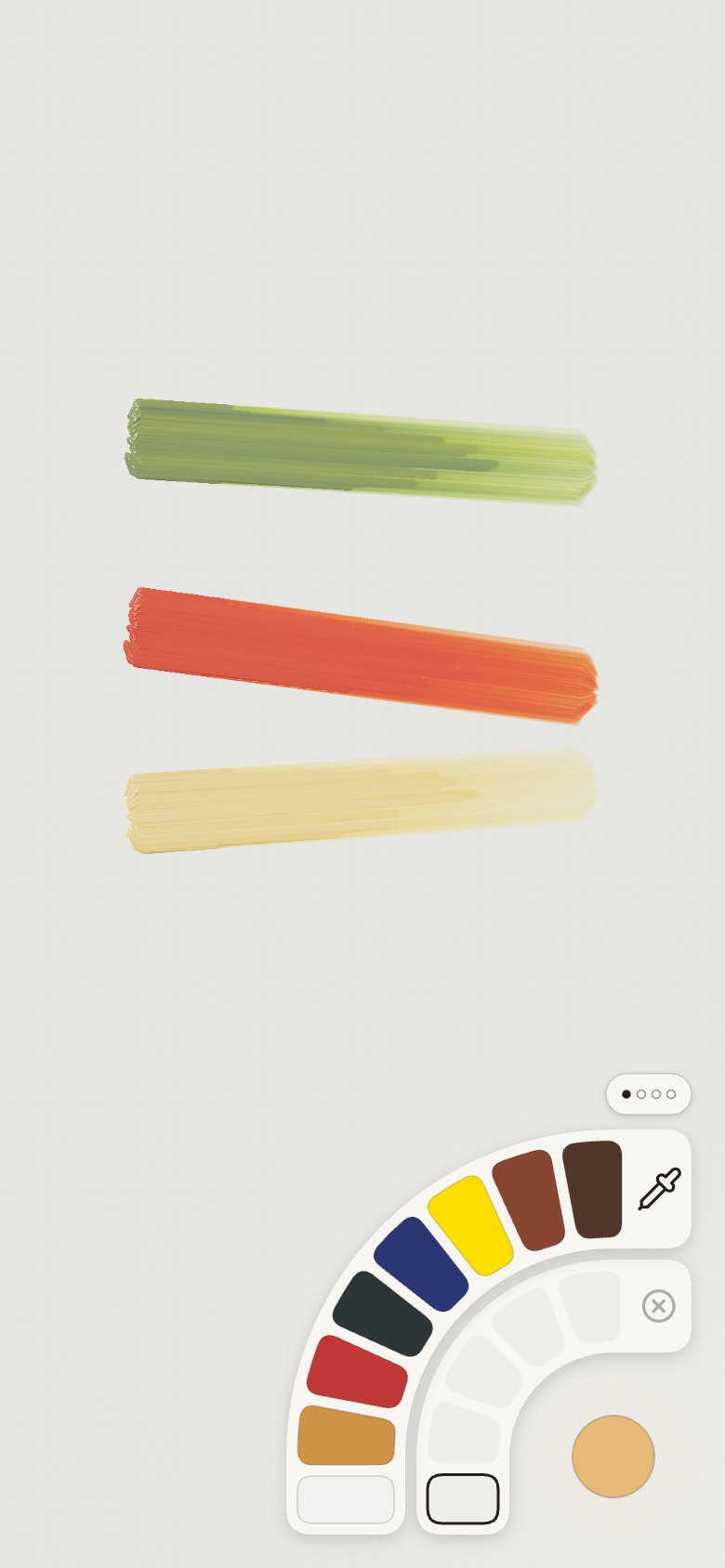
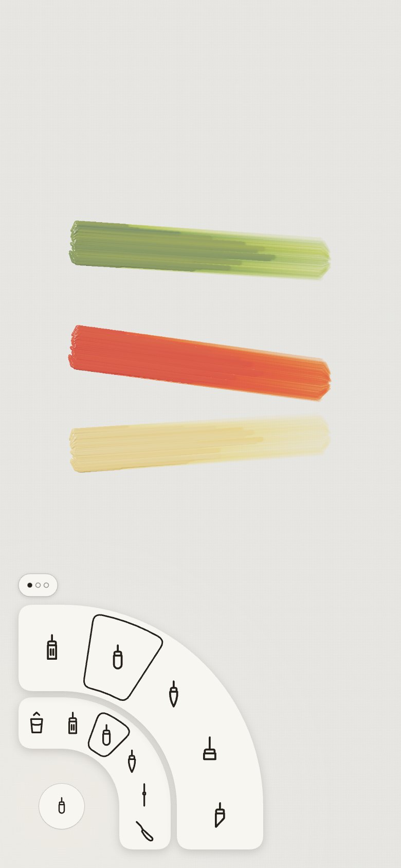
- "Make all circles 24 px, with a light stroke and a light drop shadow"; "20 px icons, colour
circle"; "iOS patterns". The four corners became iOS's round button: 44 pt circles (iOS's
smallest touch size) with a light stroke and shadow and 20 pt icons; the colour corner is a circle
of the colour. The centres didn't move, so the rings open where they did.
| Screen |
Colours |
Tools |
Easel |
Right column |
 |
 |
 |
 |
 |
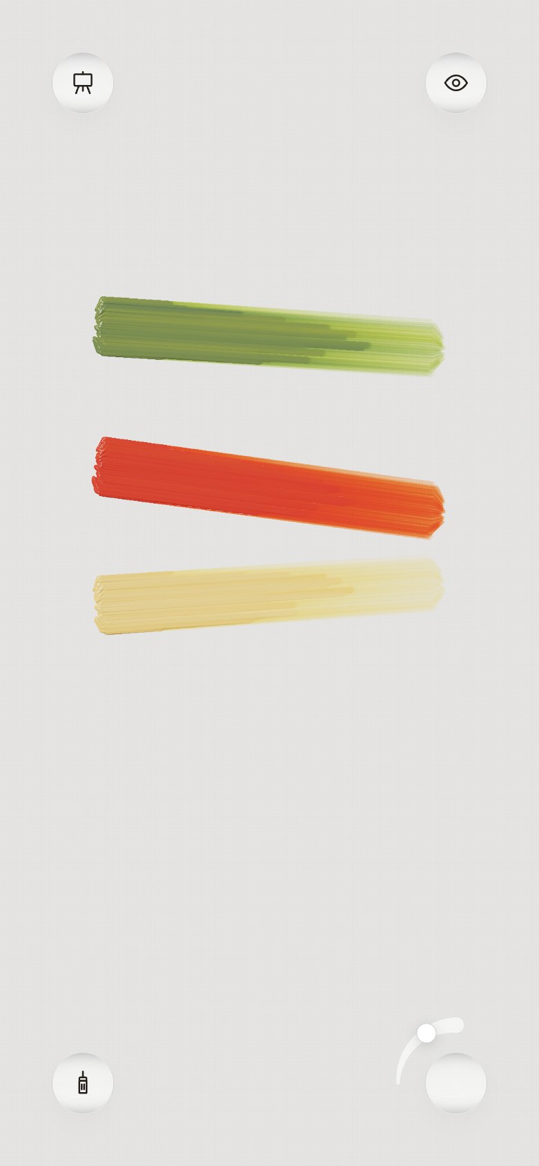
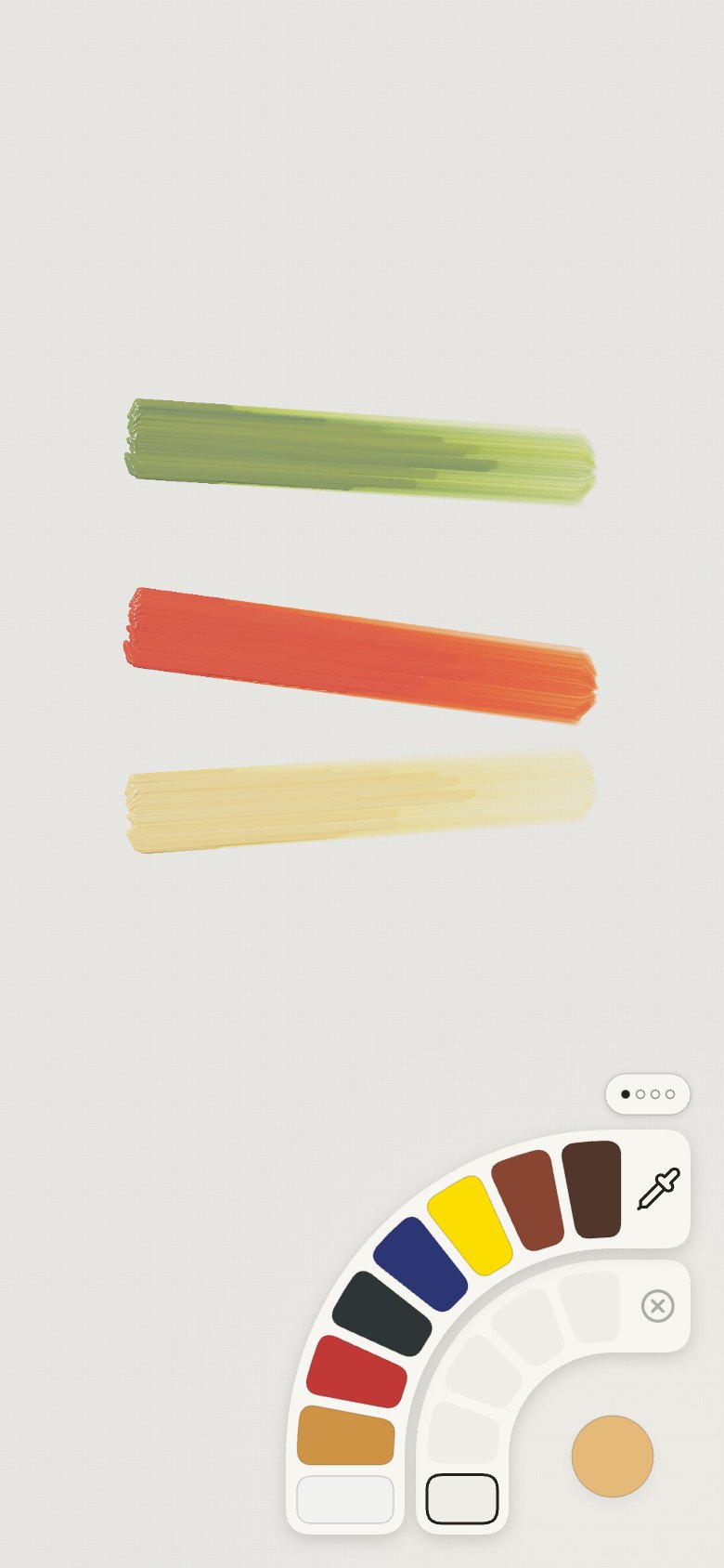
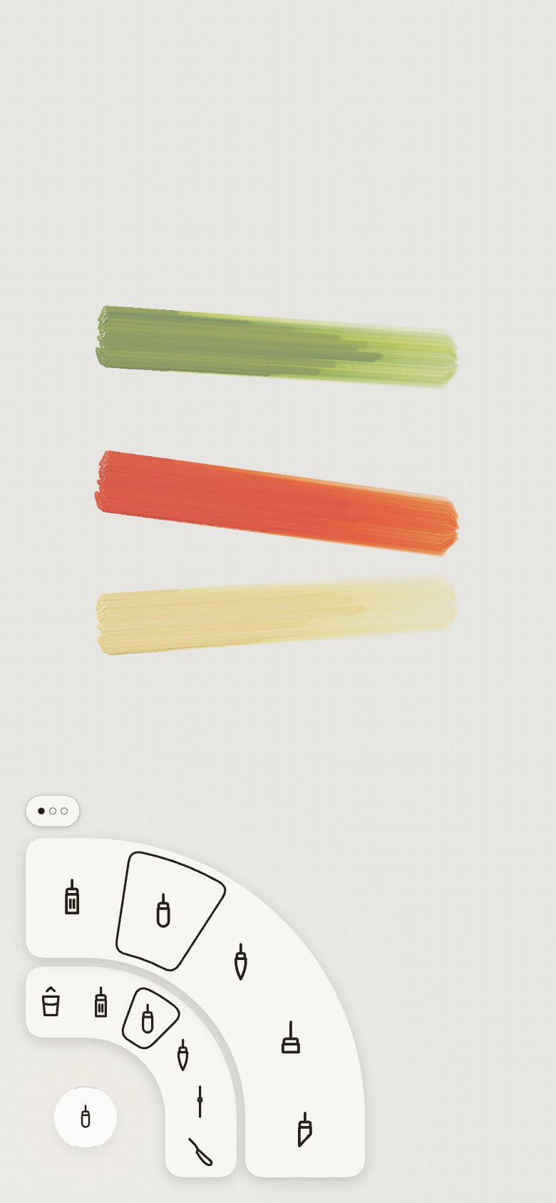
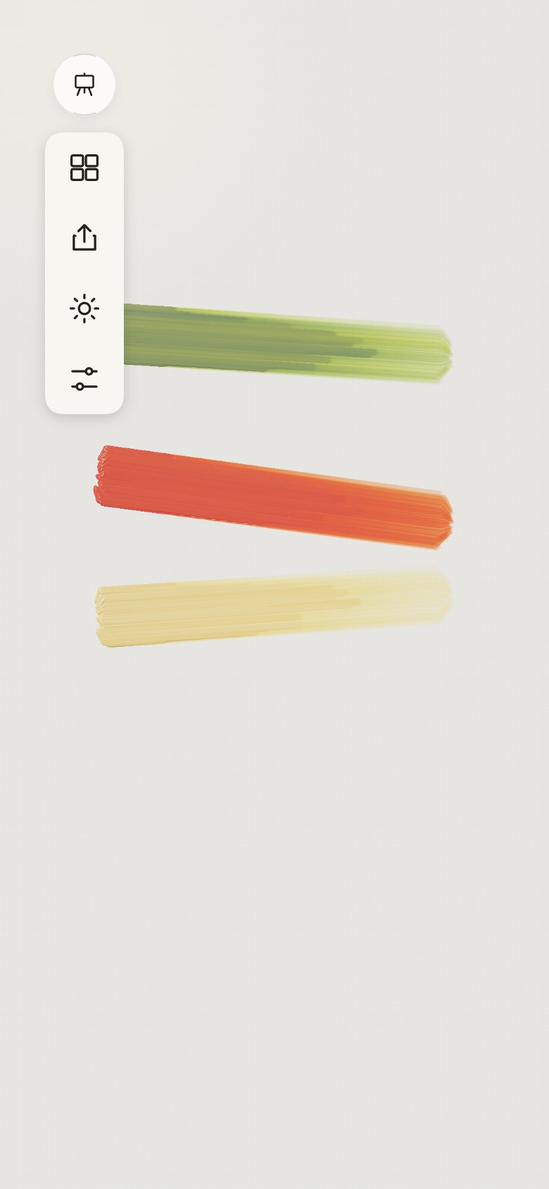
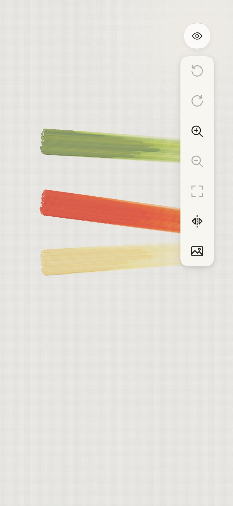
22 · Glass
- "Look at the button here": the iOS 27 UI kit's close button, iOS's Liquid Glass round button.
The corners take its finish (translucent white, a thin rim, a hairline, the faintest shadow,
inner light top and bottom), without the backdrop blur, which the WebGL canvas can't afford.
| Screen |
Colours |
Tools |
Easel |
Right column |
 |
 |
 |
 |
 |
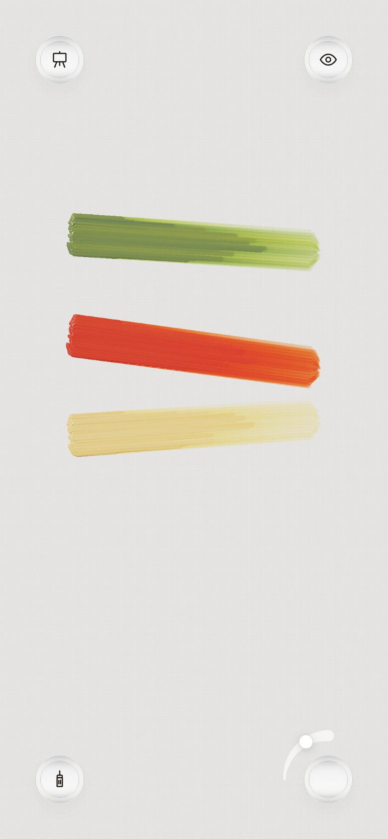
23 · Glass discs
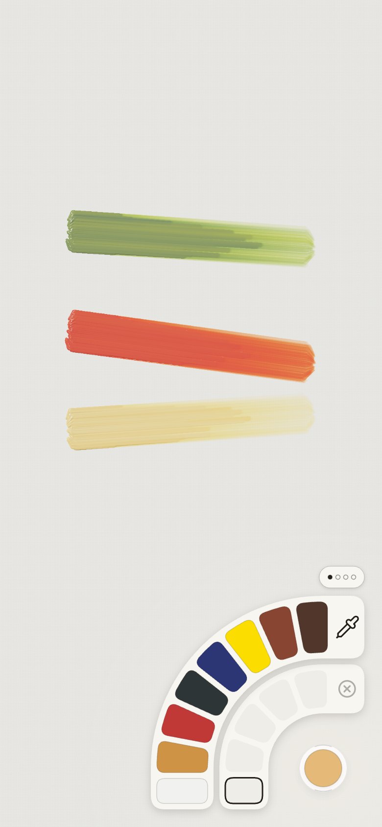
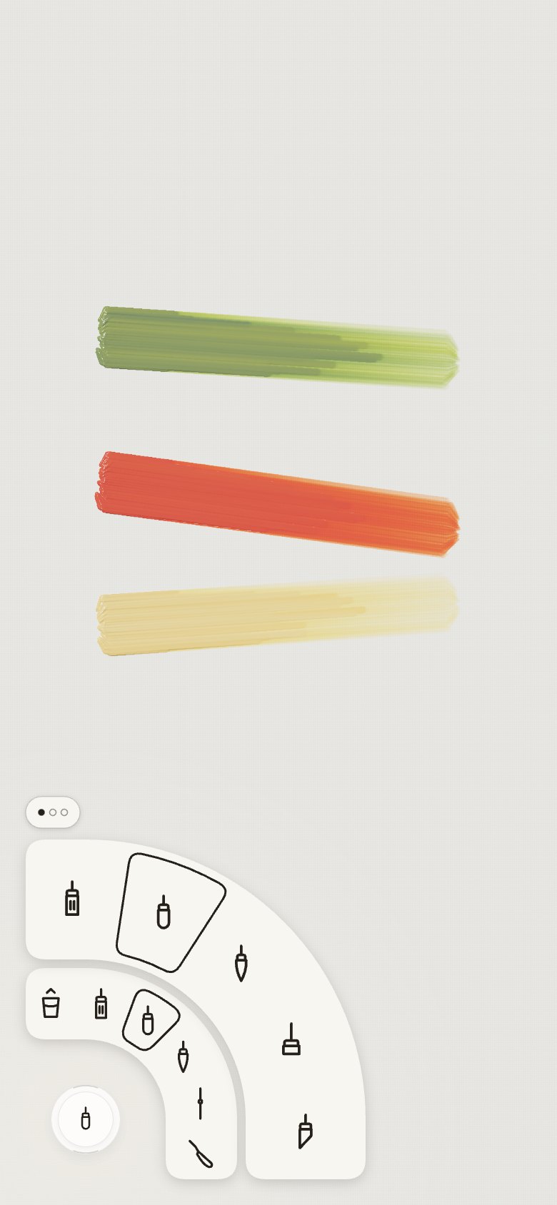
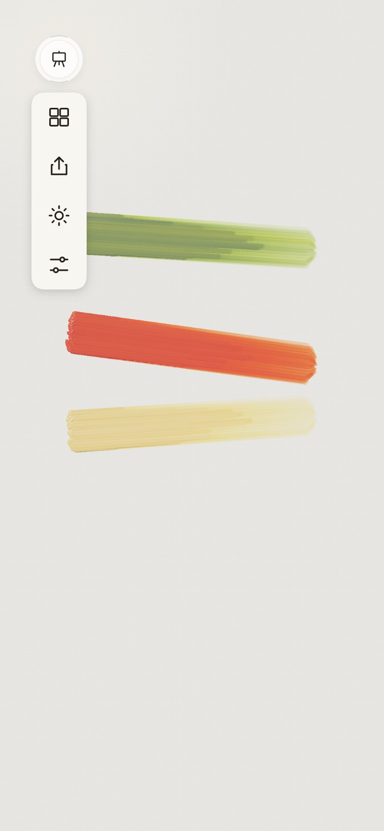
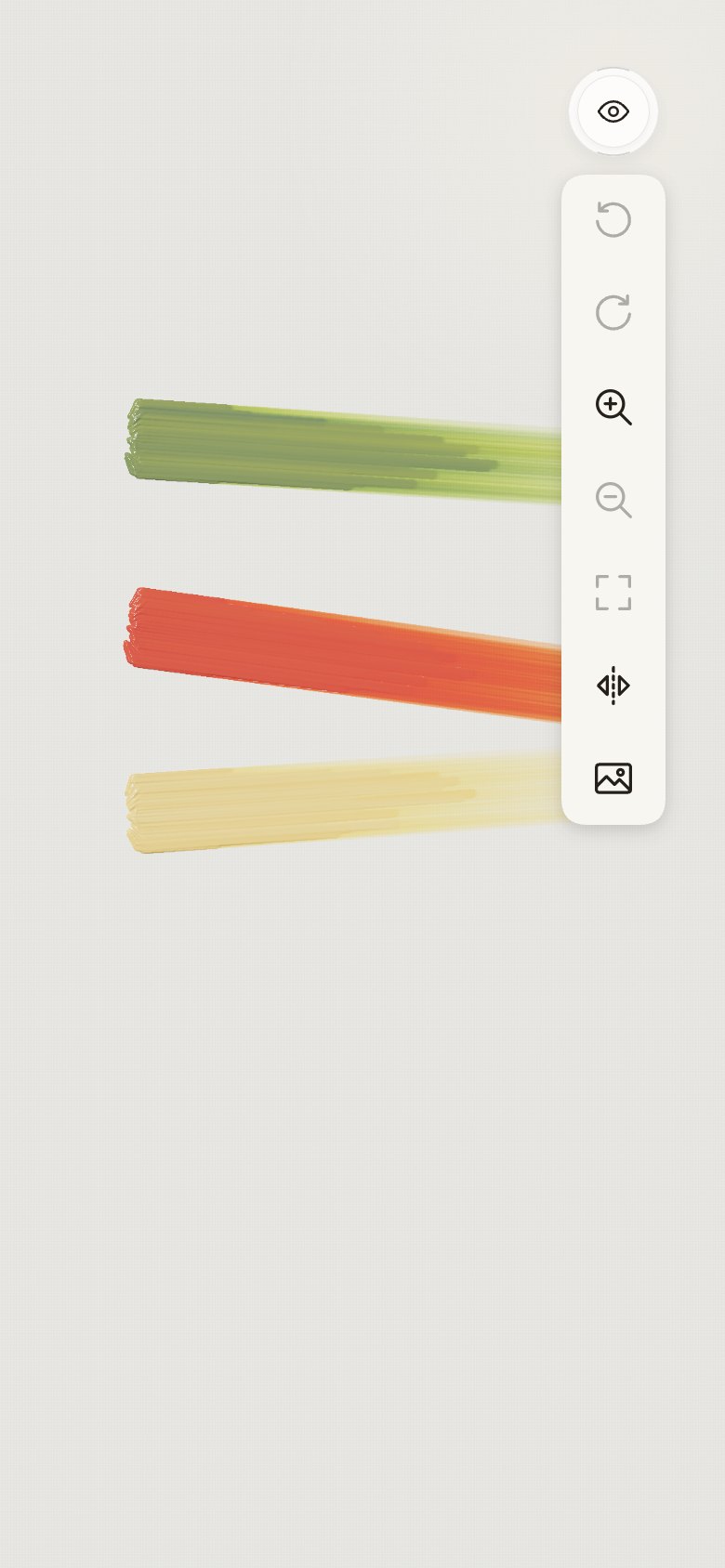
- The owner's two buttons from the iOS 27 kit, a colour button and an icon button: each is a glass
ring with a second disc inside it, glass for the icon, the colour for the colour. The corners,
now 48 pt ("make the buttons 48"), take that structure with a 38 pt inner disc.
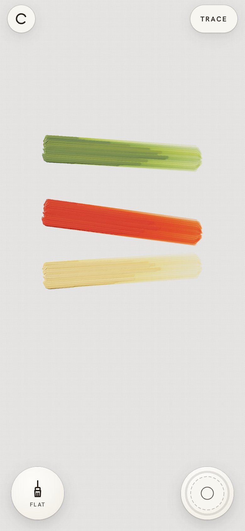
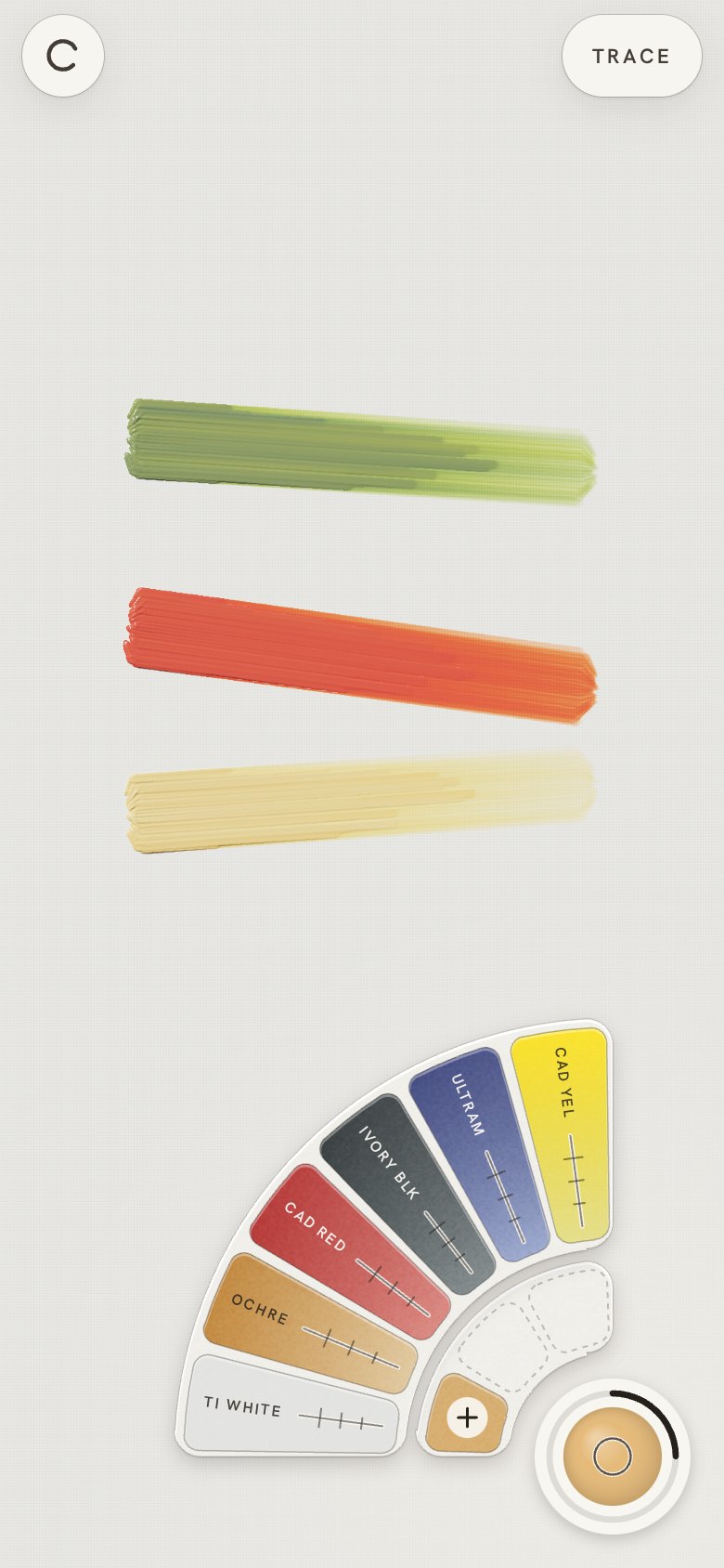
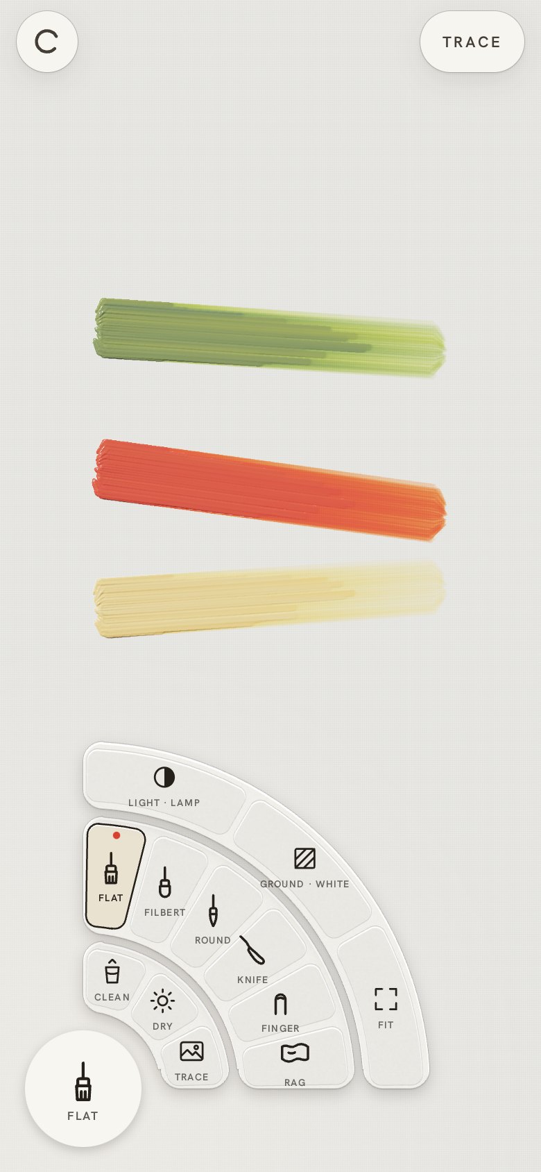
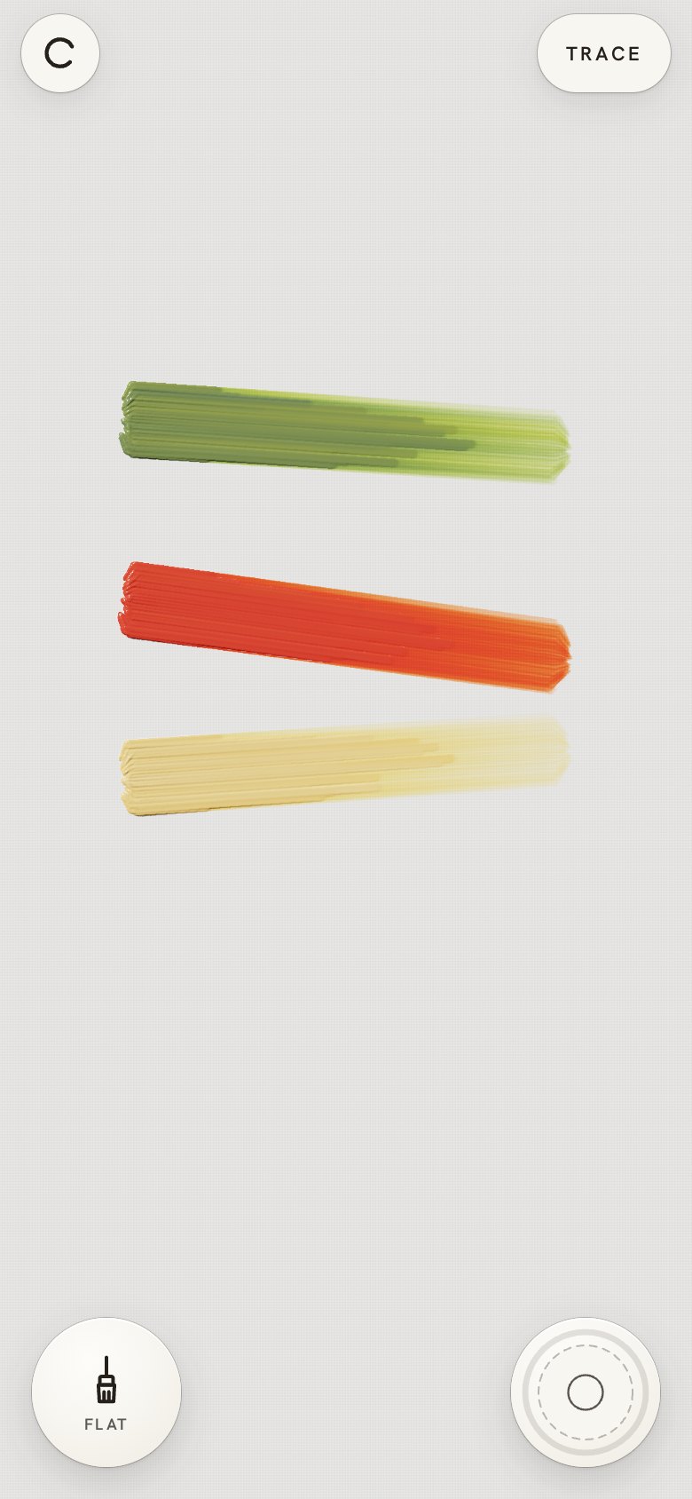
| Screen |
Colours |
Tools |
Easel |
Right column |
 |
 |
 |
 |
 |
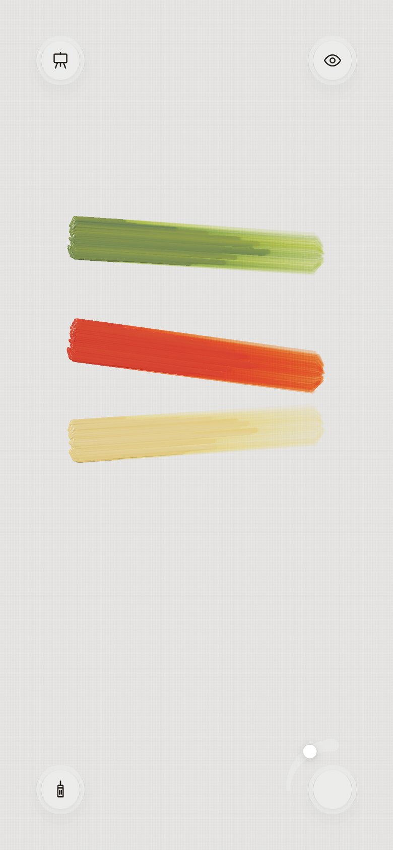
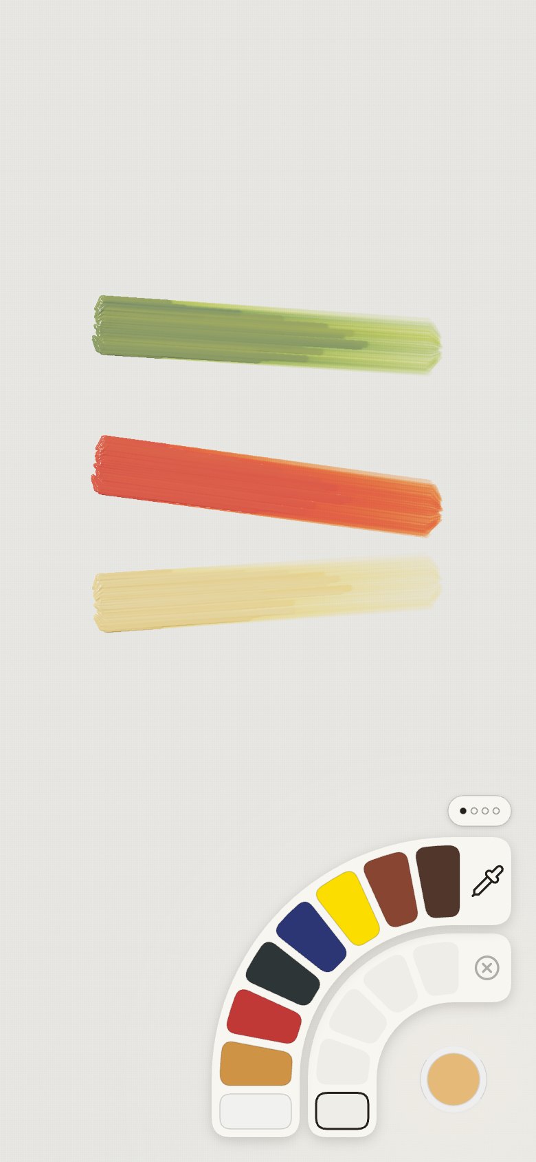
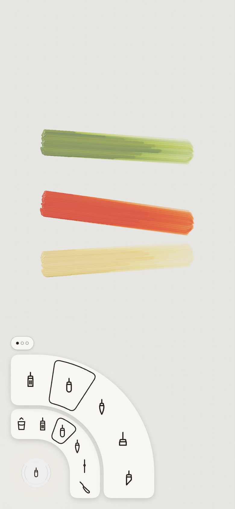
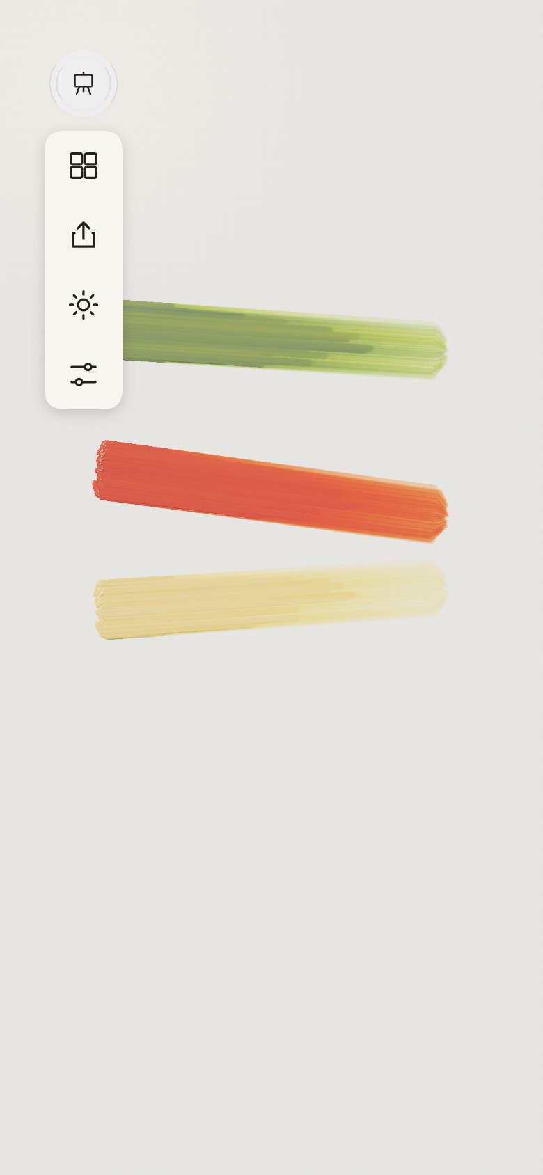
24 · The kit's glass, exactly
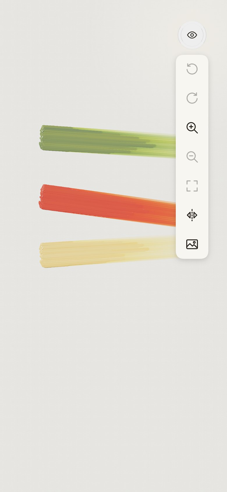
- "Use this": the iOS 27 kit's icon button. Measured from its render, ring and inner disc share one
translucent grey (248 over white, the inner disc 245), with a thin rim, a hairline and a faint
shadow, and no inner light. The corners copy it; the colour button keeps its colour inside.
| Screen |
Colours |
Tools |
Easel |
Right column |
 |
 |
 |
 |
 |
25 · Sixty
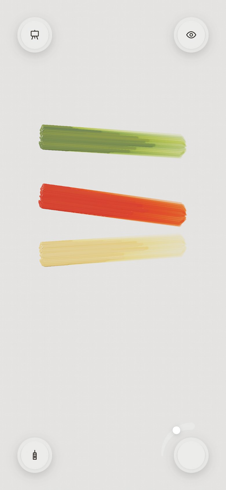
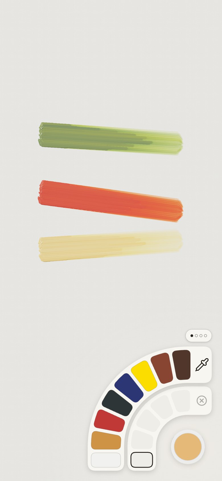
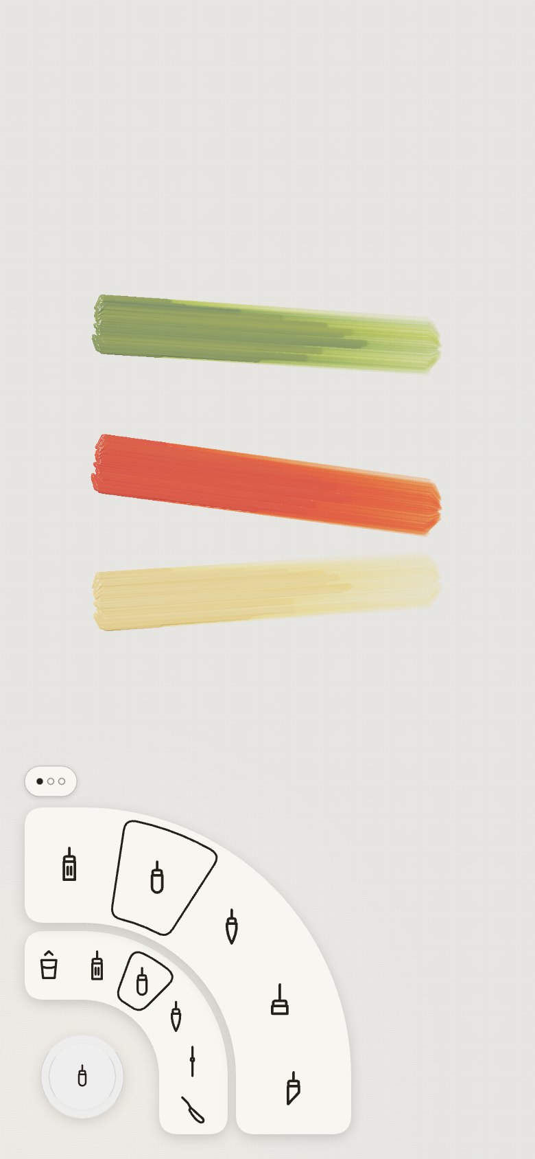
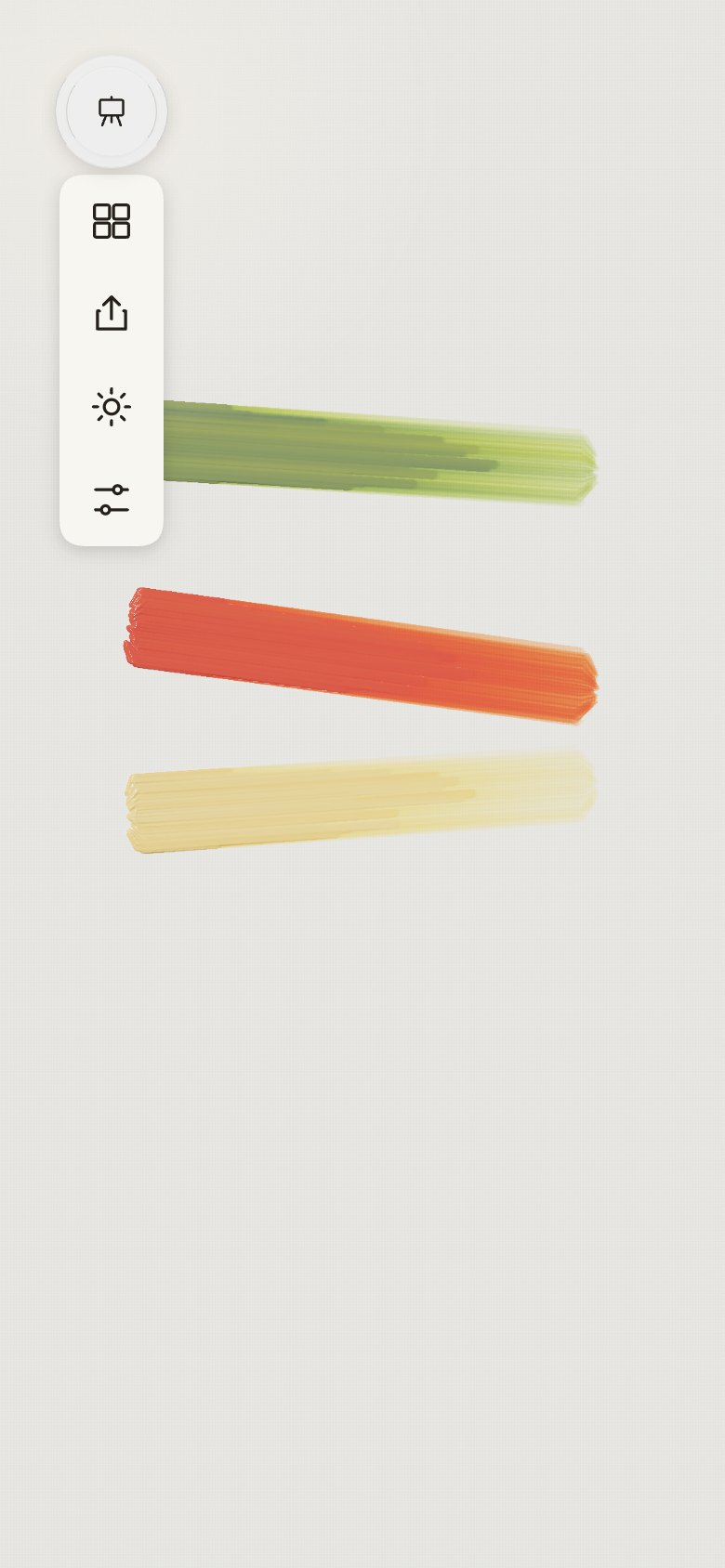
- "Let's move up to 60 px, use same drop shadow as rings." The corners are 60 pt glass buttons
with a 48 pt inner disc, and cast the same shadow as the rings they open.
| Screen |
Colours |
Tools |
Easel |
Right column |
 |
 |
 |
 |
 |
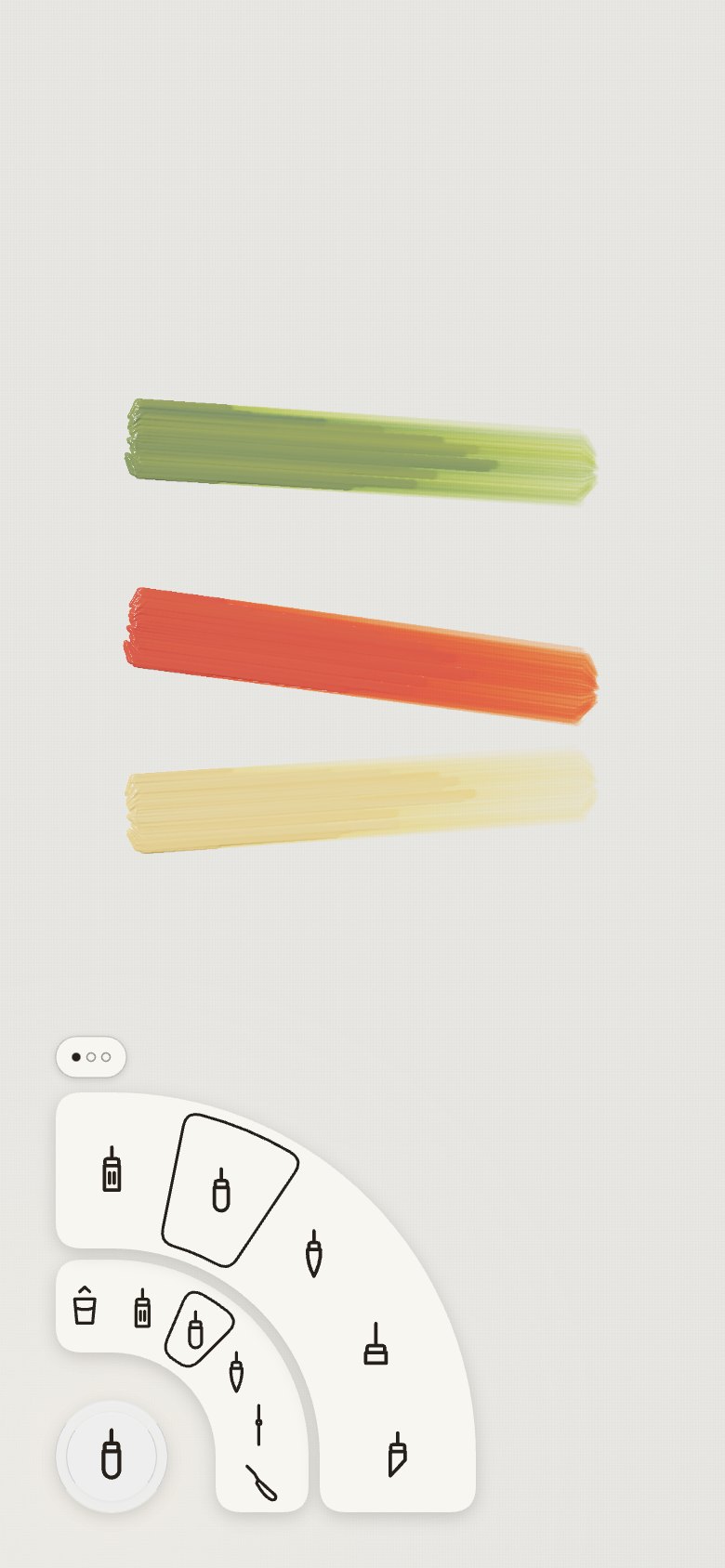
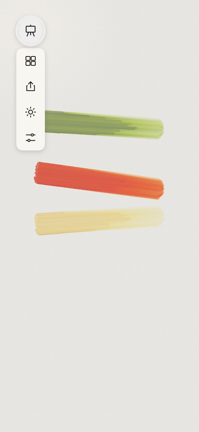
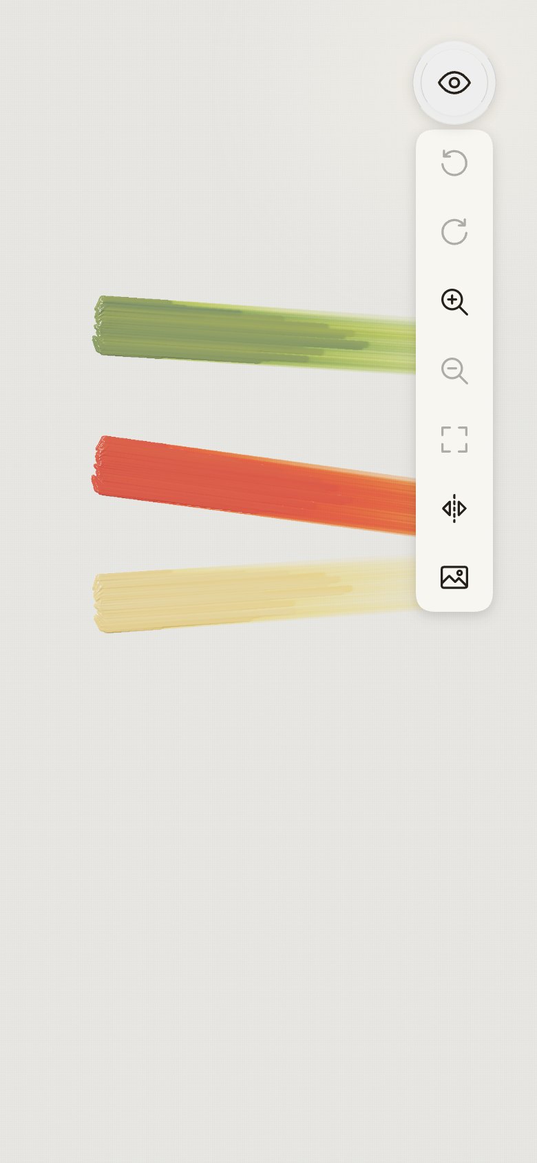
26 · Aligned
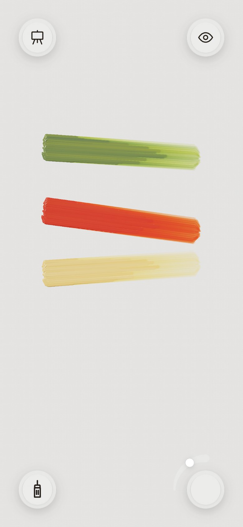
- "Make the icon in the circles bigger." 28 pt icons, and the tall, thin brush at 34 pt.
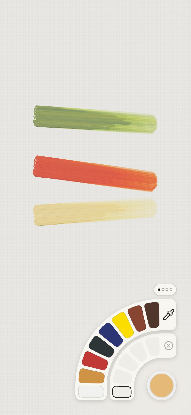
- "Align the right side of the rings to the right side of the circle and the bottom side of the
ring to the bottom side of the circle." The rings' straight ends stop level with the circle.
| Screen |
Colours |
Tools |
Easel |
Right column |
 |
 |
 |
 |
 |
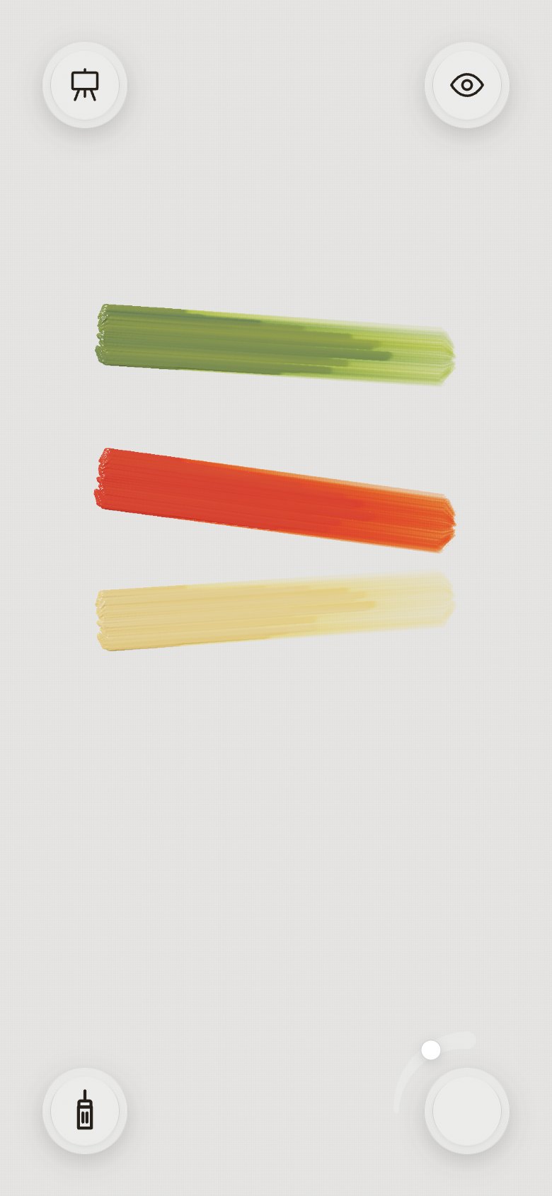
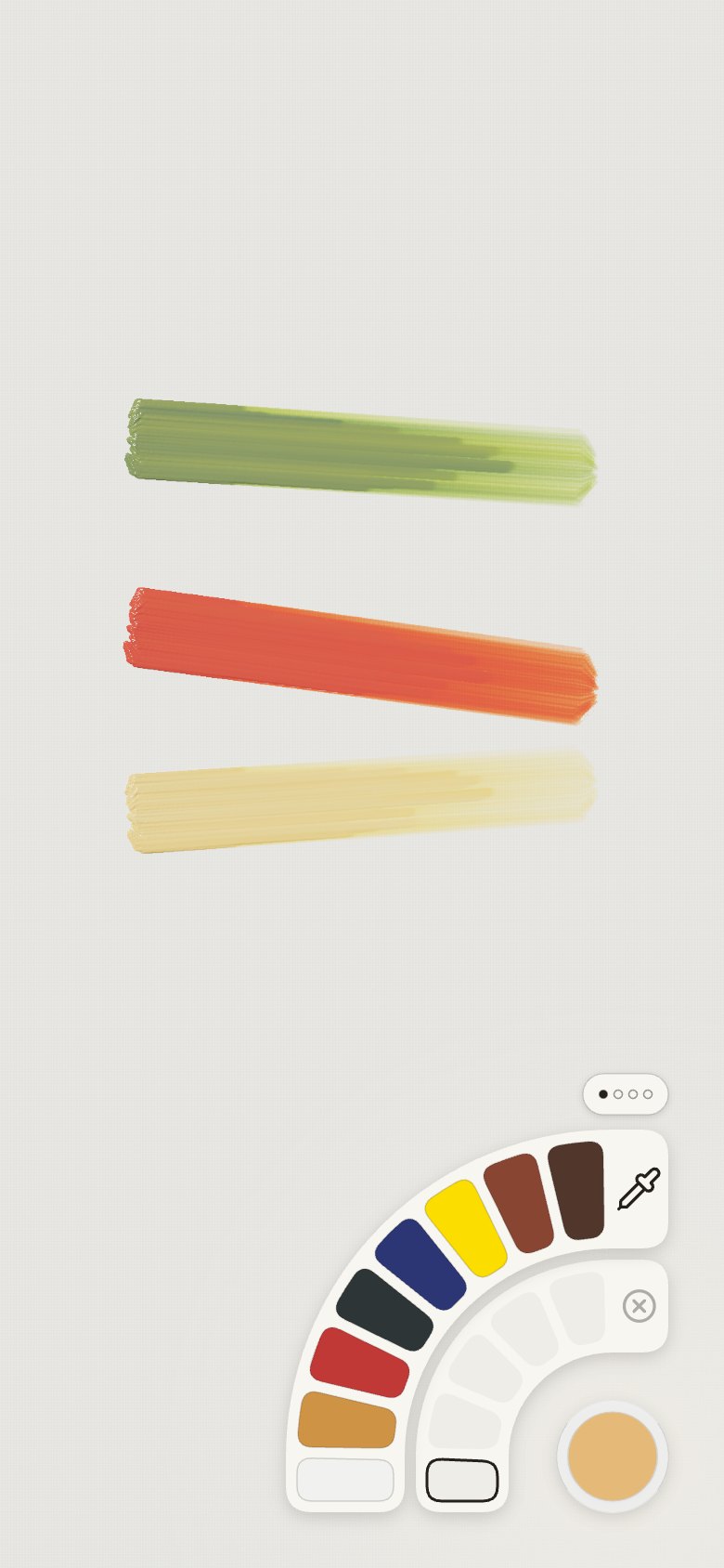
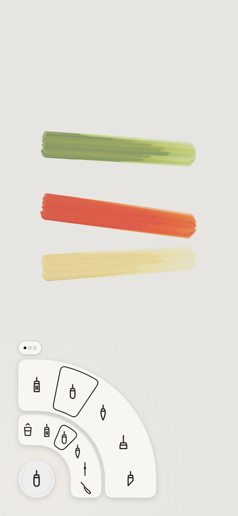
27 · The brush's outline
- "Remove the finger brush." The brushes' outer ring ends with Knife and rag; the mop does the
finger's soft blending.
- "The shape of the cursor … should represent the brush." The spot above the finger is the
tool's own outline at its real width (a flat bar, a round circle, slanted cuts for the angle and
dagger, a fan, a blade, a cloth), level before a stroke and turned across the stroke during it.
- "When someone selects the rag, the colour picker needs to indicate that they cannot select
colour." With the rag, the colour well is a struck-through dashed circle, and the colour rings
open faded with a note.
| Screen |
Colours |
Tools |
Easel |
Right column |
 |
 |
 |
 |
 |
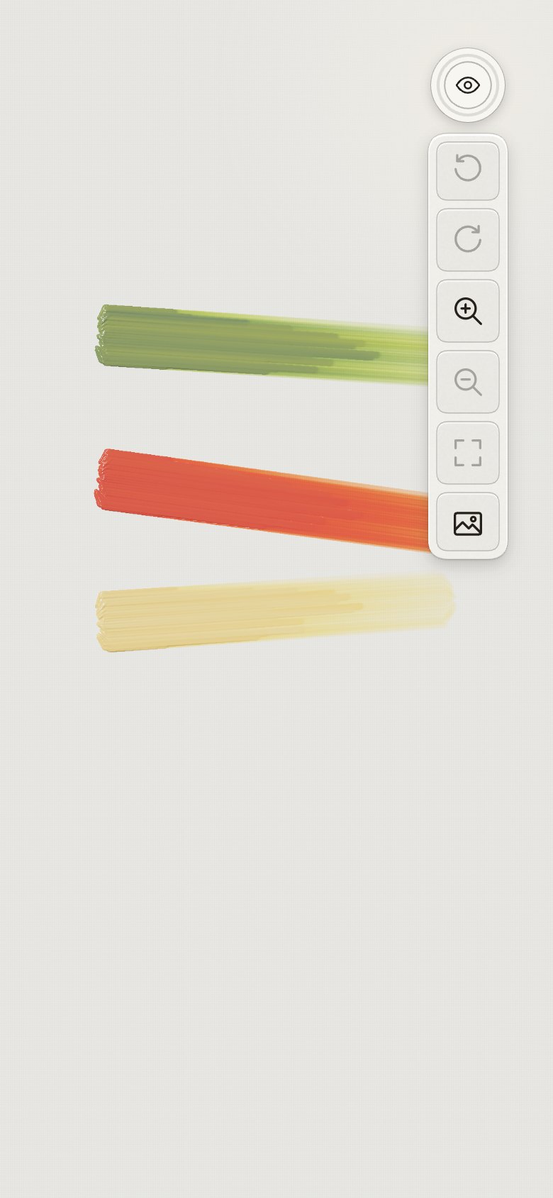
28 · Undo, one tap
- "I think we need to take undo out, maybe place it under view." Undo leaves the view column and
gets a round glass button of its own, just below the eye in the top-right corner, the same size
and kit as the four corner wells. One tap undoes the last stroke or change to a mix; the icon dims
when there is nothing to undo. Redo stays as the first tile of the view column, and a two-finger
tap on the painting still undoes.
- "The undo conflicts with the image trace tools." Then: "Use a circle like the other ones, above
the undo, under the eye." While a photo is traced, a round glass photo button takes the place
under the eye and undo steps down below it. The trace controls (strength, Crop, Fill, Change,
Remove) open on the photo button's row, to its left, clear of every button; the photo button
folds and unfolds them, replacing the small arrow that did. Remove the photo and the button goes,
and undo returns under the eye.
For articles
The thread worth writing up: a desktop pattern (a full radial menu) fitted to a phone's corner by
taking a quarter of it, and then letting the screen's geometry decide the rest. The rings became
concentric with the rounded corner, straight where the screen is straight. Along the way the
palette changed from a place you mix (a dish) to a place you keep colours (stored slots). Mixing
became counting parts, which is how painters actually talk about mixes.
Written 2026-09-26. Kept as it was written; the app may have moved on since.