The controls
A quarter of a radial,
in each corner.
Every control takes something from the painting: space, attention, a glance away from the paint. I wanted controls that wait in the corners until you want them, open under your thumb, and can be used in a single movement, eventually without looking.
A desktop idea, fitted to a phone by taking a quarter of it and letting the screen decide the rest.
I started from a radial menu I'd designed before: a full circle of choices in rings around a centre. A full circle doesn't fit a phone, but a quarter fits a corner exactly, and gives each ring the corner's whole ninety degrees. From there the screen's own geometry did the designing.
What the controls had to respect
- The painting has the screenNothing permanent over the canvas; controls appear when asked and leave when done.
- Thumbs live in the cornersA hand holding a phone rests its thumbs at the bottom corners already.
- The eye stays on the paintEvery glance at a menu is a glance away from the painting.
- The commonest action needs no controlA painter reloads the brush more than anything else, so it should take no gesture at all.
- The screen has a shapeRounded corners, straight edges and a camera in the top edge.
What I decided
Four wells, one kind of thing each
Colours bottom right and brushes bottom left, under the thumbs; the easel top left (your paintings, save, dry, Studio) and the view top right (redo, zoom, fit, mirror, a reference photo), with Undo on a button of its own just below it, one tap away. Each well sits the same distance from both edges it touches, so it is concentric with the screen's rounded corner.
Rings that follow the corner
Around each bottom well, two rings of plain paper: inside, what you keep (your mixes, your five brushes); outside, what you choose from (the pigments, every brush). The rings start at the well's own edge, curve with the screen's corner and run straight along its edges, with the same padding everywhere, so their items nest. At the top, radial rings would hit the camera, so those wells open a single column straight down instead.
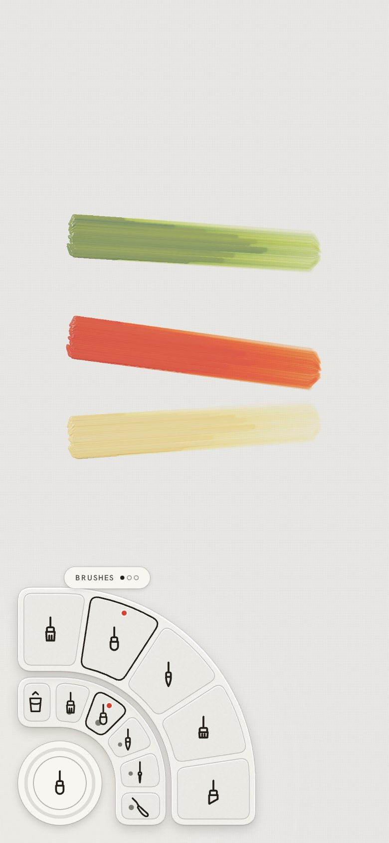
Press, slide out, lift: opening and choosing in one movement
Press a well and slide out: the rings open at once, and the same slide lands on an item; lifting chooses it. It is a marking menu, a design where a beginner presses and looks while an experienced hand makes the same short stroke without looking, because each choice is always in the same direction. While the finger slides, each item names itself, so looking is still possible. Lift on the well instead and the rings stay open for tapping.
It came from a question I asked while designing it: "Can we use marking, press and move the finger from the circle, to open it?" A tap on the brush well goes back to the previous brush; a tap on the colour well opens the rings. That tap used to pick up more paint, until every stroke began with fresh paint and there was nothing left to pick up (Ease of use).
Rings that turn for more
A quarter holds only a few items, so an outer ring turns: drag along it and the next set slides in from under its end, as a dial does. Dots above it count the sets. What must not move stays fixed at the ring's end: Clear on the inner colour ring, the eyedropper on the outer.
Showing what a choice did
A tap on a pigment throws a drop of that paint into the selected mix, with a ripple, and the mix shows its recipe as a dot per part, so the outer ring's purpose explains itself. The centre of the open rings shows the brush as it is, and dragging it up or down changes its size.
The corners fade while you paint
While a stroke is down the controls step back, and they return when it lifts. A near miss beside a well is caught by the well, and a quick tap just beside one does not dab paint.
Measured on every size of iPhone
Whether the corners are comfortable one-handed on the smallest and largest phones, and how quickly the slide becomes a habit, are for real hands to show, and I'm testing them.
The interface investigation Every version of the controls Marking menus